The Editor Color Palette allows content editors to style their blocks using the theme’s color scheme.
When a custom color palette is registered in your theme, WordPress will use CSS classes for styling elements rather than hardcode the color in the content.
There are two aspects to setting up your custom color palette:
- Register the color palette options in functions.php
- Add css for each color option in your stylesheet
I’ll also show you how I style the button block to use the color palette.
Registering your colors
In your theme’s functions.php, add support for the custom color palette by specifying the following for each color option:
- Name: visible to user
- Slug: used in CSS class
- Color: used for rendering elements in the Gutenberg block editor
Here’s an example from my Genesis starter theme:
add_theme_support( 'editor-color-palette', array(
array(
'name' => __( 'Blue', 'ea_genesis_child' ),
'slug' => 'blue',
'color' => '#59BACC',
),
array(
'name' => __( 'Green', 'ea_genesis_child' ),
'slug' => 'green',
'color' => '#58AD69',
),
array(
'name' => __( 'Orange', 'ea_genesis_child' ),
'slug' => 'orange',
'color' => '#FFBC49',
),
array(
'name' => __( 'Red', 'ea_genesis_child' ),
'slug' => 'red',
'color' => '#E2574C',
),
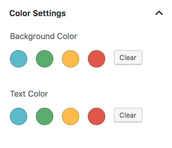
) );After adding that to your theme, you should see the following in the Color Settings panel:
Naming your color options
I’m using the actual color as the slug, which I think is the best approach for individual client sites. A few years from now we may build a new theme that looks totally different, but their color scheme for brand colors will remain unchanged.
An alternative approach is to use generic terms for the colors like primary, secondary, and tertiary. I think this is the best approach for widely distributed themes, like premium themes by StudioPress. When a user changes themes, the actual colors will change to match that theme’s style guide, allowing a seamless transition between themes.
Remove custom color picker
WordPress includes a custom color picker after our theme colors. We can disable color picker and limit them to only our color options with this:
// -- Disable Custom Colors
add_theme_support( 'disable-custom-colors' );
Your Color Settings panel should now match the screenshot at the top of this article.
CSS for your color palette
If you select the blue color as the Background Color for a block, WordPress adds .has-background and .has-blue-background-color to the block.
If you select blue as the Text Color, WordPress sets the classes to .has-text-color and .has-blue-color.
Your theme needs to provide styling for these color classes. Example:
.has-blue-color {
	color: #59BACC;
}

.has-blue-background-color {
	background-color: #59BACC;
}

.has-green-color {
	color: #58AD69;
}

...
Using SASS
You can automate this with SASS by defining an array of colors and looping over it.
// Gutenberg color options
// -- see editor-color-palette in functions.php
$colors: (
	'blue' 		: #59BACC,
	'green' 	: #58AD69,
	'orange' 	: #FFBC49,
	'red' 		: #E2574C,
);

@each $name, $color in $colors {

	.has-#{$name}-color {
		color: $color;
	}

	.has-#{$name}-background-color {
		background-color: $color;
	}
}
Button Styling
Styling the button block can be difficult given all the styling options available to editors. Hopefully soon we’ll be able to reduce the color options for the button block.
My goals with styling buttons are:
- Make the default button block match all other buttons throughout the site
- Provide appropriate hover styling based on button background color.
- Provide appropriate text color styling if editor hasn’t selected one, based on background color.
- Remove button styles that aren’t applicable.
Here’s the default button styling in WordPress:
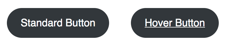
I want all buttons to be square, and the default background to be blue (the first color in my $colors array). On hover, the background should get darker and no underline should appear on the text.

/* Button block
--------------------------------------------- */

.wp-block-button__link {
	border-radius: 0;

	&:hover {
		text-decoration: none;
	}

	&:not(.has-text-color) {
		color: white;

		&:hover {
			color: white;
		}
	}

	&:not(.has-background) {
		$default: nth( nth( $colors, 1 ), 2 ); // first color in $colors array
		background-color: $default;

		&:hover,
		&:focus {
			background-color: darken( $default, 20% );
		}
	}

	@each $name, $color in $colors {

		&.has-#{$name}-color:hover,
		&.has-#{$name}-color:focus {
			color: $color;
		}

		&.has-#{$name}-background-color:hover,
		&.has-#{$name}-background-color:focus {
			background-color: darken( $color, 20% );
		}
	}

}
Here’s a summary of what’s happening since it can be a bit hard to read the SASS:
- Button should be square, not rounded
- On hover, don’t show an underline
- If the button doesn’t have a text color selected, set the default and hover text color to white.
- If the button doesn’t have a background color selected, use the first color listed in the
$colorsarray shown above, and set the hover background to be 20% darker. - For each color in our color palette:
- If the button has this text color, ensure the hover state also has this text color
- If the button has this background color, set the hover state to 20% darker.
This is just a starting point. You can tweak it as needed to match your style guide. For instance, if the blue button should have a green background color on hover, you could add:
.wp-block-button__link:not(.has-background):hover,
.wp-block-button__link.has-blue-background-color:hover {
	background-color: $green;
}
Define alternate hover color
In the SASS snippet above, we’re setting the button background color to 20% darker on hover: background-color: darken( $color, 20% ); . But often our designs call for a specific color to be used on hover.
I create two SASS arrays:
- The
$colorsone shown above, that maps the color name to its hex value. - A
$color_hoverarray, which maps the color name to the hover color hex value.
// Gutenberg color options
// -- see editor-color-palette in functions.php
$colors: (
	'blue' 		: #59BACC,
	'green' 	: #58AD69,
	'orange' 	: #FFBC49,
	'red' 		: #E2574C,
);

$color_hover: (
	'blue' 		: #226370,
	'green' 	: #2a5733,
	'orange' 	: #a36700,
	'red' 		: #811d15,
);

@each $name, $color in $colors {

	.has-#{$name}-background-color:hover {
		background-color: map_get( $color_hover, $name );
	}
}
Remove Button Block Styles
The button block includes three “Block Styles” – Rounded, Outline, and Squared. You can switch between by clicking the “Change Block Type” button in the top left corner.
On most of the sites we build, we don’t want different button styles like this. The style guide calls for buttons to be square or rounded – not a mix of both.
You can unregister these block styles using JavaScript:
editor.js
wp.domReady( () => {
	wp.blocks.unregisterBlockStyle( 'core/button', 'default' );
	wp.blocks.unregisterBlockStyle( 'core/button', 'outline' );
	wp.blocks.unregisterBlockStyle( 'core/button', 'squared' );
} );
functions.php
/**
 * Gutenberg scripts and styles
 * @link https://www.billerickson.net/wordpress-color-palette-button-styling-gutenberg
 */
function be_gutenberg_scripts() {
	wp_enqueue_script( 'be-editor', get_stylesheet_directory_uri() . '/assets/js/editor.js', array( 'wp-blocks', 'wp-dom' ), filemtime( get_stylesheet_directory() . '/assets/js/editor.js' ), true );
}
add_action( 'enqueue_block_editor_assets', 'be_gutenberg_scripts' );
For more information see Block Styles in Gutenberg.
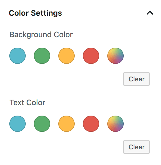
Remove gradient options
WordPress 5.3 added gradient options to the color panel for blocks. You can disable them with the following code in functions.php:
// -- Disable Gradients
add_theme_support( 'disable-custom-gradients' );
add_theme_support( 'editor-gradient-presets', array() );
Share your tips
How have you been using the color palette in your theme? Any tips or tricks on styling different blocks? Please share them in the comments below.
Marcy Diaz says
The how to deregister the button styles that shouldn’t be used, is so super useful, and it didn’t even occur to me to try that. You just made my life so much easier. Thank you, Bill!
Bill Erickson says
Happy to help!
You can also register new button styles like this: https://gist.github.com/billerickson/6bf391d39e455e4765c7a88d3c8352ee
Jose says
One thing that I would find useful would be the option of transparent for backgrounds. I’ve been searching the web but can’t find any info on this. Any tips. thanks
Bill Erickson says
You could add a “transparent” color option with a color of #FFF, then in the CSS specify
.has-transparent-background-color { background: transparent; }See: https://gist.github.com/billerickson/97ecf64393052a2ab582724dc2dce30a#file-_blocks-scss-L15-L17
Kostas Nicolacopoulos says
Very nice! Putting all the colors in an array and looping through them in SASS is a cool little trick. It saves time and keeps things organized. Thanks Bill!
ps. Don’t forget to address the focus state on your button-link styles for accessibility.
Bill Erickson says
Good point! I’ve updated the snippet above to include focus styling.
Matt Whiteley says
If anyone is looking to add inverse styles you can apply a class of `button–inverse` (or whatever you choose) and the SASS in the gist below:
https://gist.github.com/mwhiteley16/cd5d037e8e0bc9be152d1d4e6dc404ec
Chuck Smith says
Hey Bill, great article. I am wondering, is it possible to define separate pallets for background and text? The color groups are definitely different and it would be awesome this this was possible.
BTW. Love the web site design.
Bill Erickson says
As of right now you can only specify a single color palette for use everywhere. I’ve created a GitHub issue requesting the ability to reduce the color options on a per-block-type basis but it hasn’t received any traction yet.
Ben says
Hi Bill,
Really enjoying your recent Gutenberg theming blogs. In my case I use Bootstrap v4 buttons happily everywhere else in my templates and my old TinyMCE custom formats. The issue I run into is that the Bootstrap buttons have a different HTML markup to core Gutenberg button block ones. So in Bootstrap you add the relevant CSS class directly to the <a> element. In Gutenberg the class determining color, size etc is added to the wrapper div, not the <a> – which throws a spanner in my SASS works.
I’ve experimented with ACF Blocks (5.8 beta), Lazy Blocks, Block Library, Atomic Blocks etc. The issue with them is that they ether don’t use the Gutenberg color picker (where you can set your theme colours), or they return the colour as a HEX value, not as a ‘has-blue-background-color’ CSS class.
Long story short, I don’t see an easy way of filtering the actual HTML markup of the core blocks, you can only (de)register styles associated with them? Interested in your thoughts, perhaps I’ll just sit tight in the meantime as someone cleverer than me is bound to make a Bootstrap button block sooner or later.
Ben
Bill Erickson says
You’re right, I don’t believe there’s a way to filter the actual HTML markup of core blocks, and that’s probably by design. A better approach would be to remove the core button block and add a new “Bootstrap Button” block with the markup you want.
If you build a block using Javascript / React you can leverage
PanelColorSettingsto add the color picker to your own block. In Zac Gordon’s Gutenberg development course, check out 04.08 – Inspector Control Fields (code here).Jitesh says
Nice article Bill. Thanks.
Quick question: How can we reflect customizer color changes in the editor?
Bill Erickson says
I don’t use the Customizer so I’m not sure what color changes can be made there. Aren’t those usually theme-related color changes, like header or footer background color?
Jitesh says
We build & sell themes, so the customizer has theme-related colors + some element colors (for example a button). Or it can have the theme’s primary, secondary, tertiary color palette.
When someone changes colors in the customizer, these should also reflect in the editor.
Is there a hook that we can use to reflect these changes?
Bill Erickson says
The Gutenberg color palette is defined in the theme’s functions.php file using
add_theme_support( 'editor-color-palette' ). You could check the site option for the theme color and conditionally load different styles there.When a change is made in the Customizer, I assume it reloads the preview page and the new color palette would be built using the new setting.
Alex S says
Thanks for sharing this, Bill! I was wondering if you know how to apply the color palette styling options to the headline block – seems kind of weird that you can style colors and sizes with the paragraph block but not the headline one.
Bill Erickson says
Unfortunately no, I don’t think it’s possible right now to add the color palette to headings. But there’s an active discussion on GitHub about adding that feature.
Jason says
For some reason I cannot unregister the default button styles, using wp.blocks.unregisterBlockStyle. In the same function added button style works fine, but nothing I have tried removes them. Have tried different dom functions, wrapping it in jQuery and various enqueue’s… nothing works, have they updated something to make this not work anymore?
my enqueue is this
function ev_add_scripts() {

     wp_enqueue_script(

        'ev-block-btn',

        get_template_directory_uri() . '/blocks/button/block.js',

        [ 'wp-blocks', 'wp-dom-ready', 'wp-edit-post' ],

        filemtime( get_template_directory_uri() . '/blocks/button/block.js' )

    );

}

add_action( 'enqueue_block_editor_assets', 'ev_add_scripts' );
my block.js file is this
wp.domReady( function() {
wp.blocks.unregisterBlockStyle('core/button', 'rounded');
wp.blocks.unregisterBlockStyle('core/button', 'outline');
wp.blocks.unregisterBlockStyle('core/button', 'squared');
wp.blocks.registerBlockStyle('core/button', {
name: 'doubleborder',
label: 'Double Border'
});
wp.blocks.registerBlockStyle('core/button', {
name: 'doubleoffset',
label: 'Double Offset'
});
wp.blocks.registerBlockStyle('core/button', {
name: 'shadow',
label: 'Shadow'
});
});
Also have looked everywhere on how to add an extra select or dropdown option that will add an extra setting to the button but came up with nothing, Would like to add something like a size dropdown, small, medium, large, etc what would put the css class on the button for size control. Can this be done now?
Bill Erickson says
When you view the source of the Gutenberg editor, do you see your script loading?
You should use
get_stylesheet_directory()in thefilemtime(), but I don’t think that would affect the script loading.You have
wp-dom-readyas a script dependency, but I havewp-dom. I’m guessing there’s no script calledwp-dom-ready, and since that dependency doesn’t exist your script isn’t loading either. I’d also remove thewp-edit-postdependency.mf simchock says
Hey Bill – First off, thank you. These articles are the most helpful ones I’ve found so far. I’m not out of the wood yet, but at least I feel there might be hope 🙂
Question(s): Is there a way to:
1) Remove the color palettes selectively? That is, for example, with the button block to not have the background color or the text color?
2) Is there a way to assign colors selectively to a palette(s)? So, for example, background colors might all be dark, and text colors all light?
Ultimately, what I’m attempting to do is to use the default blocks – there’s no sense reinventing the wheel – but altering them to create a simplified UX / editor experience that’s also brand-centric. For example, have predefined button, quote, etc styles (read: design + colors) and less “mix and match”. Also, likely replace the Advanced > Additional CSS Class with a select, again from some finite list.
Any thoughts on these ideas would be greatly appreciated.
p.s. Is there a native Gutenberg control for displaying 2 colors together (as opposed to only single colors). For that matter, is there a listed of native controls period. I have been anything mentioned anywhere, tho’ I would think there’s a finite set to pick from, yes?
tia –
mfs
Bill Erickson says
I have yet to find a way to disable the color palette for certain block types, or modify the colors available in the palette by block type.