The Editor Color Palette allows content editors to style their blocks using the theme’s color scheme.
When a custom color palette is registered in your theme, WordPress will use CSS classes for styling elements rather than hardcode the color in the content.
There are two aspects to setting up your custom color palette:
- Register the color palette options in functions.php
- Add css for each color option in your stylesheet
I’ll also show you how I style the button block to use the color palette.
Registering your colors
In your theme’s functions.php, add support for the custom color palette by specifying the following for each color option:
- Name: visible to user
- Slug: used in CSS class
- Color: used for rendering elements in the Gutenberg block editor
Here’s an example from my Genesis starter theme:
add_theme_support( 'editor-color-palette', array(
array(
'name' => __( 'Blue', 'ea_genesis_child' ),
'slug' => 'blue',
'color' => '#59BACC',
),
array(
'name' => __( 'Green', 'ea_genesis_child' ),
'slug' => 'green',
'color' => '#58AD69',
),
array(
'name' => __( 'Orange', 'ea_genesis_child' ),
'slug' => 'orange',
'color' => '#FFBC49',
),
array(
'name' => __( 'Red', 'ea_genesis_child' ),
'slug' => 'red',
'color' => '#E2574C',
),
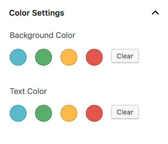
) );After adding that to your theme, you should see the following in the Color Settings panel:
Naming your color options
I’m using the actual color as the slug, which I think is the best approach for individual client sites. A few years from now we may build a new theme that looks totally different, but their color scheme for brand colors will remain unchanged.
An alternative approach is to use generic terms for the colors like primary, secondary, and tertiary. I think this is the best approach for widely distributed themes, like premium themes by StudioPress. When a user changes themes, the actual colors will change to match that theme’s style guide, allowing a seamless transition between themes.
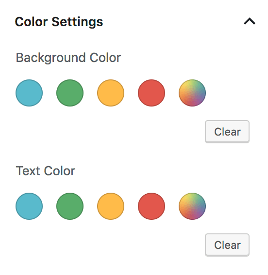
Remove custom color picker
WordPress includes a custom color picker after our theme colors. We can disable color picker and limit them to only our color options with this:
// -- Disable Custom Colors
add_theme_support( 'disable-custom-colors' );
Your Color Settings panel should now match the screenshot at the top of this article.
CSS for your color palette
If you select the blue color as the Background Color for a block, WordPress adds .has-background and .has-blue-background-color to the block.
If you select blue as the Text Color, WordPress sets the classes to .has-text-color and .has-blue-color.
Your theme needs to provide styling for these color classes. Example:
.has-blue-color {
	color: #59BACC;
}

.has-blue-background-color {
	background-color: #59BACC;
}

.has-green-color {
	color: #58AD69;
}

...
Using SASS
You can automate this with SASS by defining an array of colors and looping over it.
// Gutenberg color options
// -- see editor-color-palette in functions.php
$colors: (
	'blue' 		: #59BACC,
	'green' 	: #58AD69,
	'orange' 	: #FFBC49,
	'red' 		: #E2574C,
);

@each $name, $color in $colors {

	.has-#{$name}-color {
		color: $color;
	}

	.has-#{$name}-background-color {
		background-color: $color;
	}
}
Button Styling
Styling the button block can be difficult given all the styling options available to editors. Hopefully soon we’ll be able to reduce the color options for the button block.
My goals with styling buttons are:
- Make the default button block match all other buttons throughout the site
- Provide appropriate hover styling based on button background color.
- Provide appropriate text color styling if editor hasn’t selected one, based on background color.
- Remove button styles that aren’t applicable.
Here’s the default button styling in WordPress:
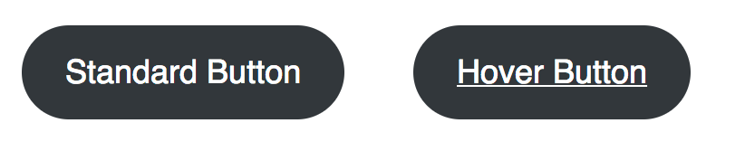
I want all buttons to be square, and the default background to be blue (the first color in my $colors array). On hover, the background should get darker and no underline should appear on the text.

/* Button block
--------------------------------------------- */

.wp-block-button__link {
	border-radius: 0;

	&:hover {
		text-decoration: none;
	}

	&:not(.has-text-color) {
		color: white;

		&:hover {
			color: white;
		}
	}

	&:not(.has-background) {
		$default: nth( nth( $colors, 1 ), 2 ); // first color in $colors array
		background-color: $default;

		&:hover,
		&:focus {
			background-color: darken( $default, 20% );
		}
	}

	@each $name, $color in $colors {

		&.has-#{$name}-color:hover,
		&.has-#{$name}-color:focus {
			color: $color;
		}

		&.has-#{$name}-background-color:hover,
		&.has-#{$name}-background-color:focus {
			background-color: darken( $color, 20% );
		}
	}

}
Here’s a summary of what’s happening since it can be a bit hard to read the SASS:
- Button should be square, not rounded
- On hover, don’t show an underline
- If the button doesn’t have a text color selected, set the default and hover text color to white.
- If the button doesn’t have a background color selected, use the first color listed in the
$colorsarray shown above, and set the hover background to be 20% darker. - For each color in our color palette:
- If the button has this text color, ensure the hover state also has this text color
- If the button has this background color, set the hover state to 20% darker.
This is just a starting point. You can tweak it as needed to match your style guide. For instance, if the blue button should have a green background color on hover, you could add:
.wp-block-button__link:not(.has-background):hover,
.wp-block-button__link.has-blue-background-color:hover {
	background-color: $green;
}
Define alternate hover color
In the SASS snippet above, we’re setting the button background color to 20% darker on hover: background-color: darken( $color, 20% ); . But often our designs call for a specific color to be used on hover.
I create two SASS arrays:
- The
$colorsone shown above, that maps the color name to its hex value. - A
$color_hoverarray, which maps the color name to the hover color hex value.
// Gutenberg color options
// -- see editor-color-palette in functions.php
$colors: (
	'blue' 		: #59BACC,
	'green' 	: #58AD69,
	'orange' 	: #FFBC49,
	'red' 		: #E2574C,
);

$color_hover: (
	'blue' 		: #226370,
	'green' 	: #2a5733,
	'orange' 	: #a36700,
	'red' 		: #811d15,
);

@each $name, $color in $colors {

	.has-#{$name}-background-color:hover {
		background-color: map_get( $color_hover, $name );
	}
}
Remove Button Block Styles
The button block includes three “Block Styles” – Rounded, Outline, and Squared. You can switch between by clicking the “Change Block Type” button in the top left corner.
On most of the sites we build, we don’t want different button styles like this. The style guide calls for buttons to be square or rounded – not a mix of both.
You can unregister these block styles using JavaScript:
editor.js
wp.domReady( () => {
	wp.blocks.unregisterBlockStyle( 'core/button', 'default' );
	wp.blocks.unregisterBlockStyle( 'core/button', 'outline' );
	wp.blocks.unregisterBlockStyle( 'core/button', 'squared' );
} );
functions.php
/**
 * Gutenberg scripts and styles
 * @link https://www.billerickson.net/wordpress-color-palette-button-styling-gutenberg
 */
function be_gutenberg_scripts() {
	wp_enqueue_script( 'be-editor', get_stylesheet_directory_uri() . '/assets/js/editor.js', array( 'wp-blocks', 'wp-dom' ), filemtime( get_stylesheet_directory() . '/assets/js/editor.js' ), true );
}
add_action( 'enqueue_block_editor_assets', 'be_gutenberg_scripts' );
For more information see Block Styles in Gutenberg.
Remove gradient options
WordPress 5.3 added gradient options to the color panel for blocks. You can disable them with the following code in functions.php:
// -- Disable Gradients
add_theme_support( 'disable-custom-gradients' );
add_theme_support( 'editor-gradient-presets', array() );
Share your tips
How have you been using the color palette in your theme? Any tips or tricks on styling different blocks? Please share them in the comments below.
Tarique Sani says
Great insightful post. I am looking for ways to add attributes like onClick and data-formkit-toggle etc to a button. Ideally a field which takes free text or repeater fields which take key:value pairs
Bill Erickson says
You’ll probably want to build your own block with ACF to generate the button with additional attributes.
ACF has a useful “Link” field that opens the WP core link modal and lets you set the URL, title, target, etc. I often use that in custom blocks that need a button.
Joyce Grace says
Is there a way to define a custom text color palette and a separate background color palette, or to force users to use certain combinations? E.g. I don’t want clients using black text on a blue button, nor do I want them using light orange on a white background. How can that be controlled? Is it just by forcing the CSS?
Bill Erickson says
Unfortunately no, there’s only a single color palette used for everything. You could force it with CSS, overriding the color selection styles on a per-block basis, or only providing styling for certain classes of each block (ex: changing the text color on a button doesn’t have any visual effect because you don’t have CSS for that).
Joyce Grace says
Also curious if there is a way to get rid of button border radius and width settings and change the colour of block editor previews? E.g. my button preview (on the right panel) is bright green, but that’s not part of the theme color palette. Not talking about the editor styles where content is edited, but the preview area on the right where someone picks “fill,” “outline,” etc.
Bill Erickson says
I’m not aware of a way to get rid of those features, but if you find one, let me know! I’d love to drop them too.
Rémi Jean says
Hi Bill,
Thanks for that, I use it in every new WP theme developement !
I’d like to go a bit further with it… I’m looking for a solution to dynamically add a color to this palette.
I’m working on a landing-page theme where the administrator can add a main color (for links, call-to-action buttons, …) when configuring his page. It’s achieved by a set of ACF options fields, applied to the whole site. But if this ACF configuration could also be applied to the palette block it would be so great !
Is there any chance to link those fields (a colorpicker or a simple text field with hex code) to modify the palette?
Or have you any idea (other than ACF) to let the administrator sets the color palette through the WP admin?
Thanks,
Jean
Bill Erickson says
You could reference the site option when defining the color palette.