The Display Posts Shortcode plugin lets you display a list of posts based on any criteria. By default it displays titles only. The example below makes it display the post’s title and full content.
I was using Codex with DeepInfra-hosted models for my benchmarking test and ran into a small compatibility problem. Codex sends requests using OpenAI’s Responses API. DeepInfra provides an OpenAI-compatible API, but the endpoint I needed was chat completions. Those formats are close but not enough for Codex to use directly. So I had Codex build DeepInfra-Codex-Shim, a small local Node.js shim that sits between Codex and DeepInfra. Codex sends a This is not a full Responses API implementation. It is a practical bridge for using DeepInfra-hosted coding models with Codex. The main thing a human has to do is provide a DeepInfra API token. The shim reads The shim runs locally: Codex points to that local URL. The request path looks like this: The shim handles the pieces I needed for Codex coding workflows: If Codex asks for streaming, the shim sends Text deltas can stream through as they arrive. Tool calls are a little different because chat completions providers send function names and arguments in fragments, so the shim accumulates those fragments and emits a complete Responses The shim also includes First, put your DeepInfra API token in your shell environment. This is the one part you should do yourself because it is your credential. For persistent CLI use, add that line to Clone the project: Install and run the tests: Start the shim: Or run the binary directly: By default, the shim listens on: You can confirm it is running with: You should see a small JSON response showing the shim is up and pointing at DeepInfra. Add a DeepInfra provider to your Codex config. The important line is Then create or update a profile that uses that provider: Now you can run Codex with a DeepInfra-hosted model: You can swap in any DeepInfra model ID you want to test: Model behavior varies. The shim can translate function-call requests and responses, but it cannot make a model reliable at tool use if the model itself does not emit OpenAI-compatible tool calls consistently. If Codex fails, test the chat passthrough first: If that works, your token, upstream URL, and model are probably fine. Any remaining issue is more likely in the Responses conversion or in how a specific model handles tools. The repo also includes an optional integration test: It makes one harmless request, These are the main environment variables: You can set the same options with CLI flags: The default host is During my benchmark tests, I dropped assistant text whenever the assistant also returned tool calls. That helped with some Codex tool-call turns, but it is a surprising default for a public project. The packaged shim preserves assistant text by default, but it can now be removed with an explicit flag: The shim does not support images, audio, built-in OpenAI tools, web search, file search, reasoning item semantics, persistent response IDs, server-side conversation state, or advanced structured output behavior. If your workflow is normal Codex coding with text and function/tool calls, the shim should be useful for actual work. If you need full Responses API compatibility, this is not that. Codex may send task prompts, repository context, file contents, diffs, commands, command output, and tool results to the model provider you choose. The shim forwards your DeepInfra token upstream but does not store it. Normal request logging is off. When you run with There is a Tokens and authorization headers are redacted from structured logs and upstream error snippets. I thought it would be fun to test a variety of open source LLMs on actual client work using Codex cli. I created a benchmark test based on real client requests in existing codebases, then sorted the tasks from easiest to hardest. The results were surprising. I found that coding benchmarks don’t necessarily line up with my real work. The smarter models often got lost in a train of thought and didn’t actually edit the files. A model that can solve a standalone programming problem is not always useful when the task is “fix this small client issue in a five-year-old WordPress theme without making a mess.” If you plan to do a similar test using Codex cli and DeepInfra, you might need a shim to connect the two. The top OpenAI models won on quality. That was not surprising. I’m sure the Anthropic models would also be towards the top, but I wanted to compare my daily driver (gpt-5.5) to open source models. MiniMax was the biggest price/performance surprise, which led me to do a second benchmark test comparing just those two models. GLM-5.2’s poor performance was also unexpected. You can see the Test Details below for more details on its run. The “cost” column shows the actual cost of running this test on DeepInfra based on the token usage. The OpenAI costs are based on their API pricing, but I’m on one of their paid plans which drastically subsidizes token usage. I used a free local model (gpt-oss-20b) as a baseline benchmark, and didn’t expect it to score in the middle of the pack on these tasks. Given the surprising results for the MiniMax models, and how close their scores were in the first test, I created a new benchmark test with six new tasks just to test those two models. All these tasks were medium-to-hard, so the scores are lower. MiniMax-M2.7 averaged 2.63 across the 6 tasks and spent $0.146. It was cheaper on tokens, but it failed three precision tasks badly. MiniMax-M2.5 averaged 3.53 across the 6 tasks and spend $0.150. It was slightly more expensive, but materially more reliable on PHP/WordPress tasks. Summary: I’m going to keep using gpt-5.5 as my primary model, but I might try using MiniMax-M2.5 for simpler tasks. This benchmark tested coding-agent behavior across four WordPress theme tasks using short, natural prompts while starting Codex in the correct theme directory with the CultivateWP standard profile active. Task 1 was a read-only brand-color lookup, Task 2 was a mechanical migration of custom ACF block manifests from apiVersion 2 to 3, Task 3 was a focused footer email/form link styling fix, and Task 4 was a broader post-header implementation. Scores are out of 5 per task, with the average reflecting the four-task run where available. The clearest pattern was that lookup and mechanical edits were much easier than design-aware implementation. Several models could find `theme.json` or update 23 `block.json` files cleanly, but struggled once the task required choosing the right SCSS/PHP source target, preserving build parity, and stopping with a small reviewable diff. GLM-5.2 averaged The result was a model that could understand the repo and identify relevant areas, but did not reliably cross from inspection into completed changes. In this benchmark, that made it weak as a hands-off coding agent despite a solid read-only task result. After the initial poor results, we made some process changes and re-ran the test, which you’ll find below in zai-org/GLM-5.2 v3.1 guarded. Kimi-K2.7-Code averaged This made Kimi one of the more frustrating runs: the exploration often looked promising, but the final worktree did not reflect that understanding. Its low estimated cost helps, but the lack of completed edits on Tasks 2-4 makes it hard to trust for unattended implementation. Step-3.5-Flash averaged Task 3 found helpful context but produced no diff, and Task 4 was skipped after the reduced task set showed below-threshold implementation behavior. The tiny cost is interesting, but the edits were not reviewable enough for real production use. Nemotron Ultra averaged The implementation side was the problem. Task 3 did not land a source fix and left behind a backup artifact. Task 4 was skipped for budget protection, so the overall result was a strong start followed by an expensive implementation failure. DeepSeek-V4-Pro averaged Task 3 ran for more than 11 minutes without producing a diff, and Task 4 was not run. The model appeared to be reasoning toward a plausible source target, but for this benchmark the scored deliverable was the finished worktree, not the direction of travel. The cost-to-output ratio was poor. Qwen3.6-35B-A3B averaged Task 3 produced a plausible local CSS change, but likely targeted the narrower block CSS path instead of the intended footer form output. It also burned more than 2M input tokens on that scoped styling task. Task 4 was effectively a no-op on the actual worktree, which kept the overall score below the stronger partial implementers. The local Its weakness was implementation follow-through. Task 3 identified relevant block files but never edited CSS or SCSS, and Task 4 returned almost immediately with no useful work. The model was cheap and tidy, but not capable enough for the two realistic coding tasks in this benchmark. The guarded GLM-5.2 rerun averaged The guardrail did not fix broader implementation reliability. Tasks 3 and 4 still burned time on inspection and ended without useful diffs before operator caps. It was a meaningful improvement over the original GLM run, but not enough to make it competitive with the better implementation performers. DeepSeek-V4-Flash averaged The implementation quality was still only partial. Task 3 was syntactically clean but likely missed the intended footer form link target, and included a risky truncate-and-recover episode. Task 4 refreshed visible post-header styling with source and compiled CSS, but missed deeper template and recipe-card compatibility behavior expected by the golden path. Task 3 attempted the right area but produced brittle styling work: malformed source SCSS, hand-appended compiled CSS, and a link color that likely failed the readability goal in the dark footer. Task 4 produced valid PHP and some useful conditional behavior, but skipped source SCSS and broader recipe-template compatibility. It was a real coding run, just not a clean one. MiniMax-M2.7 averaged The implementation tasks were real but partial. Task 3 made a plausible local block CSS fix, but probably missed the actual footer form path. Task 4 improved PHP structure and source SCSS more cleanly than M2.5, but did not update compiled CSS or address the broader WPRM/template compatibility expected by the reference implementation. For the cost, it was impressive; for production use, it still needed careful review. MiniMax-M2.5 averaged Its weaker side was implementation precision. Task 3 produced a diff instead of stalling, but likely targeted the wrong footer form source path and dumped a large compiled CSS file into the transcript. Task 4 touched PHP, source SCSS, and compiled CSS, but missed major golden-path behavior around metadata helpers and WPRM recipe-template compatibility, and validation left some artifact concerns. GPT-5.4 averaged Its implementation tasks were meaningfully better than the open-model field, though still not perfect. Task 3 likely fixed the front-end readability issue, but did so with a new enqueued stylesheet and broader WPForms targeting than the reference. Task 4 delivered valid PHP and runtime CSS, but missed several golden touch points. GPT-5.5 was the top performer, averaging The most important difference was that GPT-5.5 produced the strongest implementation results. Task 3 was functional, scoped, accessibility-conscious, and kept source SCSS and compiled CSS in sync. Task 4 was a genuine hard-task implementation with focused files, clean PHP syntax, compiled front-end CSS, and reasonable use of existing helpers. It still missed parts of the historical golden direction, but it was the best practical coding-agent result in the benchmark. I run Hermes on a separate computer instead of my daily machine. The remote machine can stay online all the time, keep scheduled jobs running, receive messages from Telegram or Mattermost, and handle long-running tasks without depending on whether my laptop is awake. There’s also a security and separation benefit. Hermes can use tools, run terminal commands, read files, manage credentials, and connect to other services. I’d rather keep that on a dedicated machine with a narrower purpose than mix it into the computer I use all day. I happened to have an unused mini PC, so I set it up there. If you don’t have spare hardware, you can also run Hermes on a small cloud server like DeepInfra, which is about $13/month, or a DigitalOcean droplet, which is closer to $24/month. I use Tailscale to put my Hermes computer, desktop, NAS, laptop, and phone on the same private network. That lets me reach each device from anywhere without opening it up to the public internet. My Hermes box still sits at home, but I can connect to it from my laptop whenever I’m away. I use Telegram and Mattermost with Hermes occasionally, but most of my interaction has been through the terminal. That works well, but it also means SSHing into the machine, opening a shell, and using Hermes from there. I recently found out the Hermes Desktop app can connect to a remote Hermes agent. You still install the desktop app locally, but instead of using the local Hermes instance it installs, you point it at the dashboard running on your remote Hermes machine. That gives you the nicer desktop UI while keeping the actual Hermes runtime on your always-on machine. The desktop app connects to the Hermes dashboard backend, not the messaging gateway used by Telegram, Mattermost, and Slack. On the remote Hermes machine, first configure dashboard authentication. If you’re connecting over Tailscale and not exposing it to the public internet, the simplest option is username/password basic auth. Stop any dashboard currently running in insecure mode: Then create a dashboard username, password hash, and stable signing secret: The stable Now start the dashboard on an address your desktop can reach. In both of the following snippets, change Verify that authentication is enabled: You want to see: If For long-term use, keep the dashboard running under systemd, tmux, or whatever process manager you use on that machine. The desktop app can only connect while the dashboard process is running. Next, install Hermes Desktop on your laptop or desktop computer. The app will install Hermes locally. That’s fine, but it’s not the Hermes instance we’re going to use. The local install is mainly there so the desktop shell can run. Once the app opens and gets to the local setup flow, go to: Settings → Gateway and select “Remote Gateway”. Then paste your remote dashboard URL. If you’re on the same local network, that might be something like After entering the URL, sign in with the basic auth credentials you created earlier. User = admin, password = whatever you typed in. Save and reconnect. Hermes Desktop should now be talking to your remote Hermes agent instead of the local one. The remote machine is responsible for the actual Hermes runtime: tools, memory, sessions, cron jobs, gateway connections, project files, and long-running work. Your laptop or desktop computer gets the interface: a native app, easier session browsing, model controls, file previews, and a nicer way to chat with the same agent. You can still use the terminal when you want, and you can still use Telegram or Mattermost when that’s more convenient. But for longer working sessions, Hermes Desktop gives you a better front end. WordPress is not always the right solution for a website. That is a strange sentence for me to write. I have spent 20 years building with WordPress, and I still think it is the right tool for many publishers, including my clients at CultivateWP. In the past, I used WordPress for everything: blogs, business sites, internal CRMs, and even a rebuild of my favorite bookmarking site. But I no longer reach for WordPress automatically. For many small business and brochure sites, Astro is now a better fit. A site that once needed a CMS, custom fields, plugins, and an admin workflow can often become a simple static site with Markdown content and developer-assisted, or AI-assisted, updates. I recently rebuilt the Sundheim Group site by moving a nine-year-old WordPress site to a static Astro build hosted on Cloudflare. My Hermes agent did the first pass: creating an inventory of the old site’s content, creating a design brief from the existing WordPress site, and rebuilding the content with Astro components. The important work came next: reviewing what transferred well, fixing what did not, and rebuilding the pieces that WordPress plugins used to handle. Astro is a good fit when the public site is mostly static and the editing workflow does not need to happen in a CMS. That describes a lot of business websites. WordPress is often being used as a database for simple pages that only change a few times a year. The Sundheim Group site was a good example. We built the original site in 2017. Since then, only minimal content changes had been made, and they were done by sending me Word docs. Doug’s active writing and podcast work had moved to Substack. The WordPress site had become the front door: services, case studies, credibility, and contact. Keeping WordPress live meant managed hosting, plugin updates, backups, security patches, and an admin backend that was rarely used. Astro let us keep the public website and remove the ongoing CMS burden. The new site is hosted for free on Cloudflare. The first step is not design. It is inventory. Before rebuilding anything, I wanted to know exactly what existed on the old site: WordPress SEO plugin sitemaps are useful for this. They list posts, pages, custom post types, taxonomies, and last modified dates. I turned that into a The goal was not to redesign Sundheim Group from scratch. The old site already had an established, professional visual identity. The rebuild needed to preserve that feel while replacing the implementation with cleaner, reusable pieces. I created a DESIGN.md file from the existing website. It described the typography, color palette, page structure, spacing, components, and design guardrails. Once the content inventory and design brief were in place, the agent had enough context to build the first Astro version. You can copy the obvious pages and still miss the behavior hiding in the content. Old WordPress sites often contain newsletter embeds, Gravity Forms, survey scripts, YouTube shortcodes, tracking snippets, unexpected image paths, redirects, and one-off page templates. On this project, the first Astro pass moved the visible content over but left broken functionality as static markup in the page. The cleanup pass found the important details: I extracted the contact form into a reusable Astro component. Submissions post to a Cloudflare Worker, which verifies a Turnstile captcha server-side, normalizes the fields, and sends the notification through Cloudflare’s Email Service The form does not need SMTP or a paid transactional email service. It uses a verified Cloudflare Email Routing destination address. In Cloudflare, destination addresses are account-level verified recipients. The same verified address can receive direct sends from a Worker. For the newsletter page, I inspected the live Substack form and rebuilt a simple static form that posts to Substack’s real endpoint. For the assessment page, I kept the SurveyGizmo script because that page’s purpose was the external assessment. The difference is that it now lives in a route-specific component instead of being buried inside a large escaped content blob. Astro gives you a clean slate, which is both helpful and dangerous. A static site can be very SEO-friendly, but not if every page hand-rolls its own title tag, canonical URL, Open Graph tags, and schema. Joost’s Astro SEO: the definitive guide really helped me with this. He recommends centralizing SEO instead of sprinkling tags throughout the site. On these Astro builds, that means: SEO should be part of the site system, not something you remember to paste into individual pages. Astro starts with a big advantage: static HTML, minimal JavaScript, and assets that can be served from a CDN. That does not mean there’s no room for improvement. On Sundheim Group, the old WordPress site scored 35 for mobile performance in PageSpeed Insights. After the initial Astro build, the score was around 85. I eventually reached 100 across Performance, Accessibility, Best Practices, and SEO by fixing the boring details: Astro makes a fast site easier to build, but PageSpeed still rewards the same practical work: image sizes, font loading, layout stability, and delay/defer scripts. AI agents are great at optimizing Astro sites because Lighthouse gives them a tight feedback loop and they are in control of the entire stack. They can run the audit, identify the next bottleneck, make a focused change, and test again. That is much harder on WordPress. I can hyper-optimize a WordPress theme, but a plugin or script added after launch can wipe out those gains. The tradeoff is editing convenience. WordPress gives non-technical users an admin UI. Astro gives you a simpler, faster, safer public site, but content changes usually move into Git, Markdown, code review, and deployment. For many business clients, that is not a problem. If they only make minor content changes a few times a year, emailing me directly can be easier than logging into WordPress. The cost savings on hosting and plugins can also exceed the cost of having me make those occasional updates. But this is not a universal recommendation. For active publishers, the lack of a full CMS is usually a non-starter. Their editorial workflow is built around WordPress, custom fields, roles, previews, revisions, recipe plugins, and team habits. An Astro-based CMS may be interesting, but it will not replace that workflow for most of them. I still recommend WordPress when the site needs an editorial workflow, like most of my clients at CultivateWP. I recommend Astro when the site is mostly static, the content can live in Markdown, and the owner values speed, security, low maintenance, and simple infrastructure more than a browser-based editing experience. The key is to decide that up front. You should clearly communicate the pros and cons to the client, and let them make the decision. A hybrid WordPress theme uses theme.json to define styles and customize the block editor while also using traditional PHP template files. Hybrid themes leverage the block editor for content but not for building the theme itself. Block themes use the new Site Editor for building and customizing the theme directly in the block editor. BE Starter is a free starter theme to help you build hybrid WordPress themes. At CultivateWP we’ve built hybrid themes since before the block editor officially shipped in WordPress 5.0, and have built hundreds of hybrid themes for clients. We have an internal starter theme we use on all projects, which is continually updated with new features, improvements, and fixes with each major WP release. BE Starter is a copy of our Cultivate Starter theme, but without all the food-blogger-specific functionality. By the way, we’ll be growing our development team soon, so if you enjoy working on hybrid WordPress themes, let me know! We use a fully tokenized design process so every key in theme.json maps to a Figma design token. The designers will customize the tokens to create a site’s style guide (ex: change all the brand colors, tweak the box shadows, adjust the font sizes). As they design the site, everything will be styled using these tokens. When it’s time to develop the site, the developer customizes the theme.json file based on the settings in Figma Design Tokens. Then it’s simply a matter of styling elements with the appropriate tokens. For instance, h1 might use the “Colossal” font size while h2 uses “Huge”. If custom font families are required, we’ll use a slug of “primary” and register them like this. This Google Webfonts Helper is really useful for downloading the font files. We try to use primary/secondary/etc instead of overly-specific names for colors and font families so that when we redesign a site, we don’t end up with something like We use a contrast checker to determine which brand colors should use “foreground” (a dark color) or white as the text color. Make sure you edit _blocks-core.scss and include any colors here that should use white text. Use the I have another article that goes into more detail about building ACF blocks with block.json. The starter theme will make it even easier for you to create these blocks: Most of your blocks will only need a block.json file to register the block, a render.php file for the markup of the block, and a style.css file to style the block. If you have additional code you need to load, you can create an init.php file which will be loaded on the init hook with a priority of 5. For instance, in the social links block I’ve included in the starter theme, the init.php file has a function for retrieving all of the site’s social links from Yoast SEO. The blocks built in this method are totally self-contained. When it’s time to redesign a site, you can copy the entire /blocks directory to the new theme and everything will just work. The blocks are styled with standard CSS (no SASS compiling) and CSS variables generated from the theme.json file. Ex: The block’s CSS file does not pass through WordPress’ filter to auto-prepend them with We use “block areas” to bring the block editor to global areas of the site (ex: sidebar, after post). While you could use block-based widget areas in a similar way, I prefer a CPT because we add an admin body class of The theme includes a custom post type called “Block Areas” which appears under the Appearance section of the WP backend. It includes an ACF field group for linking a block area post to a theme-registered block area (sidebar, after-post, before-footer, 404). To create the sidebar block area: You can add/edit/remove the registered block areas in inc/block-areas.php. To display a block area in your theme, use Here’s a guide with more information on the SASS Compile Setup. Once you have the theme set up in your local environment, run When you’re ready to commit your changes to a repo or push the theme live, you can run Include your SVG files in assets/icons/utility or create additional icon folders (ex: assets/icons/category). I recommend using svgo or SVGOMG to minify and clean them up. Make sure the SVGs do not have a width and height attribute, but instead use the viewBox, and have the same width and height (ie: square artboard). Example: You can display these icons using the In addition to making it easy to load inline SVGs, this function includes smart caching to minimize the page load time. Let’s say you have a heart icon that appears next to every post title on an archive page to save it. If you were to use an inline SVG, you’d load the full markup of that SVG every time that SVG appears. Instead, when you call the “heart” icon with be_icon() it outputs If you have a complicated SVG that is having issues displaying with this smart caching (usually because it has its own IDs inside it) you can include See the be_icon() function for all the available settings. Inside the editor.js file we’re unregistering a lot of core WP blocks that are related to full site editing. Inside inc/login-logo.php you can customize the The hybrid theme approach has radically improved our design and development process. Our new Cultivate Pro service is only possible because of theme.json, Figma design tokens, and self-contained, reusable ACF blocks. We’re able to build a fully custom WordPress theme in 8-12 hours rather than the 30-40hrs it used to take. Clients love how deeply integrated the block editor is in our themes. The color palettes use their brand colors, the font sizes and families use their style guide, and they’re able to edit all the content on the site – from simple posts, to the homepage, to the sidebar – using the block editor. I’m excited to explore Full Site Editing and watch it mature over the next few years, but our team will be using hybrid WordPress themes for client work for the foreseeable future. ACF 6.0 includes a major improvement to the way blocks are built. It now supports using block.json, which aligns with WordPress core’s preferred method for block registration. Why is this important? As WordPress ships new features for blocks, you can start using them right away. Blocks are registered “the WordPress way” so support all WP core features. You don’t have to wait for ACF to add support for a new feature. What does this mean for my older blocks? Blocks built using acf_register_block_type() will continue working exactly as expected, and there’s no need to go back and update older code. I recommend using the new method for all future blocks though. To start using this today, you’ll need to log into your ACF account and download the latest release candidate. If you’re having problems with your blocks not showing up, first make sure you’re on ACF 6.0, then run your block.json file through a JSON validator to see if there are any issues. Unfortunately there’s no error messages when you have a typo in your JSON file. Table of Contents Each block will have a block.json file, so it works best to have a directory for each block. I recommend creating a /blocks/ directory in your theme or plugin to hold them. Create a block.json file in your block-specific folder. Example: /blocks/tip/block.json Most of this will line up with settings for acf_register_block_type(), but there are some important things to note: For the If you need to load a JavaScript file along with your block, use the Make sure you also register that script and specify any dependencies. If you are leveraging the ACF JS API ( ex: If you use a namespace other than “acf/” you need to use the full block name in the callback, so: The This will load the actual CSS directly in the document’s head. This means the CSS file is not loaded as a separate request, decreasing the initial page load time (pro), but also that the CSS file isn’t browser cached, slightly increasing the subsequent page load time (con). Place your style.css file inside the block directory (ex: /wp-content/themes/my-theme/blocks/tip/style.css). This will run Quick rant about styles: If you are using a FSE theme (“block theme”) then the style loading will work exactly as you expect. The CSS files and inline styles will only load if that page contains the block. If you’re like me and building “classic” PHP based themes, WordPress loads every registered block style in the header, regardless of whether that block exists on the page. You can use the The WP core argument (as I understand it) is that we don’t know exactly which blocks are on the page currently. They could be in the post content, or in reusable blocks, or in block-based widget areas, or other block-based features. While that is all true, I would’ve preferred loading the CSS files we do know are in the post content in the header and loading any missing ones in the footer. I had built my own CSS loader that figured out which blocks appeared on the page, but now I opt for using WP Rocket to strip unused CSS from the page. If you need to load a JavaScript file along with your block, use the Make sure you also register that script and specify any dependencies. If you are leveraging the ACF JS API ( ex: If you use a namespace other than “acf/” you need to use the full block name in the callback, so: You can specify a Dashicons icon to use, or include an actual SVG: ACF Specific settings will go in this array. Use Use Alternatively, you can use Use Use In this example, the only feature this block supports is a background color: You can set the default attributes for the block features. For instance, if the block supports a background color, you can have that block use the For more information, see the Block Editor Handbook article on Metadata in block.json. You should now have a folder in your theme/plugin with block.json, style.css, and render.php. The next step is to tell WordPress about your block using In your plugin or theme’s functions.php file, add: That’s it! Now your custom block should be accessible in the block editor. While the above works as a basic example, there are some ways we can improve this: Here’s the code I use in my themes, followed by a description of what it’s doing. My The code does the following for each block: Ask ACF Support 🙂. I’m closing comments on this post because I likely won’t have time to answer questions & troubleshoot issues, but ACF’s support team is excellent and very responsive. I’ll also update this post with more information and resources as I find them. The core WordPress blocks like button and group all share a global color palette. This saves a lot of time because you don’t have to style many variations of each block – every block with a class of If you’re using theme.json, this becomes even more powerful because you can customize the color palette on a per-block-type level. At CultivateWP we build a lot of custom blocks with ACF. In the past, when we needed the global color palette we would either wrap our custom block in a group block that had the color styling, or use Matt Whiteley’s guide on syncing ACF colors with the Gutenberg palette. But Matt’s approach doesn’t work with theme.json. A developer on our team (Chris Brailsford) just found a better way. When registering a new block with To add support for the color feature, add This adds support for both the Background Color and Text Color fields. For more control, you can pass an array to specify which of those two fields should be displayed. Selecting a color from the palette adds a class to your block for styling. This automatically works in the backend because the block editor adds the class for you, but you’ll also need to update your block markup to add the class on the frontend. Inside your block template file, check for When you upload a favicon image in the WordPress customizer, it provides a helpful preview to see how your favicon will appear in browsers using light or dark mode. When the favicon color doesn’t work well with dark mode, a common fix is to replace the transparent PNG with a JPG that has a white background, but then you end up with a white square in dark mode. Alternatively, you can use an SVG for the favicon and modify the favicon styling based on the color scheme. You can see this in use in the recent NerdPress redesign we just launched. Create a square SVG with your desired icon. It will look something like this: Remove any styling from the shapes in the SVG (so the You can use I added my favicon.svg to my theme’s Add the following code to your theme’s functions.php file to include the SVG favicon. It seems that the SVG favicon is prioritized over the WP generated one regardless of whether it appears before or after it in the page markup, but I have the priority set to 100 so it will appear after, just in case. Even with this approach, you should upload a JPG version of the favicon in the WordPress customizer. There are still many browsers that don’t support SVG favicons so you’ll want a fallback. My favorite new feature in Advanced Custom Fields 5.9 is support for InnerBlocks. This allows you to insert any block (core or custom) inside your ACF block. Rather than having to create your own fields for Title, Content, and Button in your custom block, you can simply insert Table of Contents When registering your ACF block, include In your template partial for the block, include It’s helpful to fill the InnerBlocks field with default content so the block looks correct when first inserted. We’re building a new site for Nice Kicks, and they often need to highlight the release date and details for new sneakers. We built a Release Info block that uses InnerBlocks for the content area. Rather than just having an empty white box when they first insert the block, we pre-populate it with default content using a block template. Inside the block’s template file, create a You can find the available block attributes in a blocks.json file for each block in wp-includes/blocks. In the above example we set the starting content for the block. If you were to publish the post without changing the text, the default content would appear in the blocks. Alternatively, you can use the I had two issues with placeholders, which is why I used default content instead: To use placeholders with the above example, change the And this was the result: You can limit which blocks can be inserted into your InnerBlocks field using the Using the example above, I can limit the Release Info block to only include the heading and paragraph blocks: You can also limit the flexibility by locking the template. Adding Adding I recently built an Icon Heading block. The icon can be selected in the block settings sidebar using a dynamic dropdown field. I used InnerBlocks for the heading itself so it would have all the standard options for customizing the heading (change block style, change heading type to h3). I used While I try to support all the core blocks in the themes I build, sometimes it makes sense to remove a few. Typically it’s because I built a custom block that’s similar to a core block while addressing the design and functional requirements of the theme. Most of my themes include a “Content and Image” block that’s similar to the “Media & Text” block but it uses the theme’s grid layout. Sometimes I’ll unregister the “Search” block and create my own that uses the You can use the I also enqueue any custom fonts used on the frontend so I can also use them in the editor styles. Now that you’ve created an editor.js file and enqueued it into the block editor, you can use Here’s a list of all the core block types. The above code only unregisters the block from the “Edit Post” screen. If you’re trying to remove blocks from the Widgets screen, Full Site Editor, or Template Parts, you’ll need to adjust the dependencies. Please refer to Jason Lemahieu’s article for more information: How to Unregister WordPress Blocks (from everywhere!)POST /v1/responses request to the shim. The shim converts that request to POST /chat/completions for DeepInfra, then converts the result back into a Responses-shaped object Codex can understand.DEEPINFRA_TOKEN, and Codex uses that same environment variable in its provider config. Once that token is available, the rest is the kind of setup an AI coding harness can handle – just point it to this blog post.What the shim does
http://127.0.0.1:8797/v1
Codex
-> local shim /v1/responses
-> DeepInfra /v1/openai/chat/completions
-> local shim
-> Responses-shaped output for Codex
stream: true to DeepInfra and converts DeepInfra’s streamed chat-completion chunks into Responses-style server-sent events for Codex.function_call item when the upstream stream finishes.POST /v1/chat/completions as a passthrough endpoint. Codex does not need that endpoint, but it makes smoke testing easier because you can check your DeepInfra token and model before debugging the Responses conversion.Setup
export DEEPINFRA_TOKEN="your_deepinfra_api_token"
~/.zshrc or your shell profile.git clone https://github.com/billerickson/DeepInfra-Codex-Shim.git
cd DeepInfra-Codex-Shim
npm install
npm test
npm start -- --log-requests
node bin/deepinfra-codex-shim.js --log-requests
http://127.0.0.1:8797/v1
curl http://127.0.0.1:8797/health
Codex configuration
env_key = "DEEPINFRA_TOKEN", which tells Codex to use the same token you exported above. Codex config formats may change, so treat this as a template:[model_providers.deepinfra]
name = "DeepInfra via local shim"
base_url = "http://127.0.0.1:8797/v1"
env_key = "DEEPINFRA_TOKEN"
wire_api = "responses"
[profiles.deepinfra]
model_provider = "deepinfra"
model = "deepseek-ai/DeepSeek-V4-Flash"
codex --profile deepinfra --model deepseek-ai/DeepSeek-V4-Flash
codex --profile deepinfra --model stepfun-ai/Step-3.5-Flash
codex --profile deepinfra --model MiniMaxAI/MiniMax-M2.5
Smoke testing DeepInfra
curl http://127.0.0.1:8797/v1/chat/completions \
-H "content-type: application/json" \
-H "authorization: Bearer $DEEPINFRA_TOKEN" \
-d '{"model":"deepseek-ai/DeepSeek-V4-Flash","messages":[{"role":"user","content":"Reply with exactly OK."}]}'
DEEPINFRA_TOKEN=... npm run test:integration
Reply with exactly OK., and checks that the shim returns a Codex-compatible response.Configuration
DEEPINFRA_CODEX_SHIM_HOST=127.0.0.1
DEEPINFRA_CODEX_SHIM_PORT=8797
DEEPINFRA_CODEX_SHIM_UPSTREAM=https://api.deepinfra.com/v1/openai
DEEPINFRA_CODEX_SHIM_API_KEY_ENV=DEEPINFRA_TOKEN
DEEPINFRA_CODEX_SHIM_LOG_LEVEL=info
DEEPINFRA_CODEX_SHIM_LOG_REQUESTS=false
DEEPINFRA_CODEX_SHIM_LOG_CONTENT=false
DEEPINFRA_CODEX_SHIM_TIMEOUT_MS=120000
DEEPINFRA_CODEX_SHIM_MAX_BODY_BYTES=10485760
DEEPINFRA_CODEX_SHIM_COMPAT_DROP_TOOL_CALL_CONTENT=false
node bin/deepinfra-codex-shim.js \
--host 127.0.0.1 \
--port 8797 \
--upstream https://api.deepinfra.com/v1/openai \
--api-key-env DEEPINFRA_TOKEN \
--log-requests
127.0.0.1, and I would keep it that way unless you have a specific reason to expose the shim elsewhere. The shim does not add its own authentication layer. It just forwards provider credentials upstream.A compatibility note
node bin/deepinfra-codex-shim.js --compat-drop-tool-call-content
What it does not support
Privacy and logging
--log-requests, it logs request shape, model names, tool counts, and request IDs. It does not log full prompts or tool outputs.--log-content flag for deeper debugging, but it can print code and prompt content. I would only use it locally, briefly, and intentionally.Summary of Results
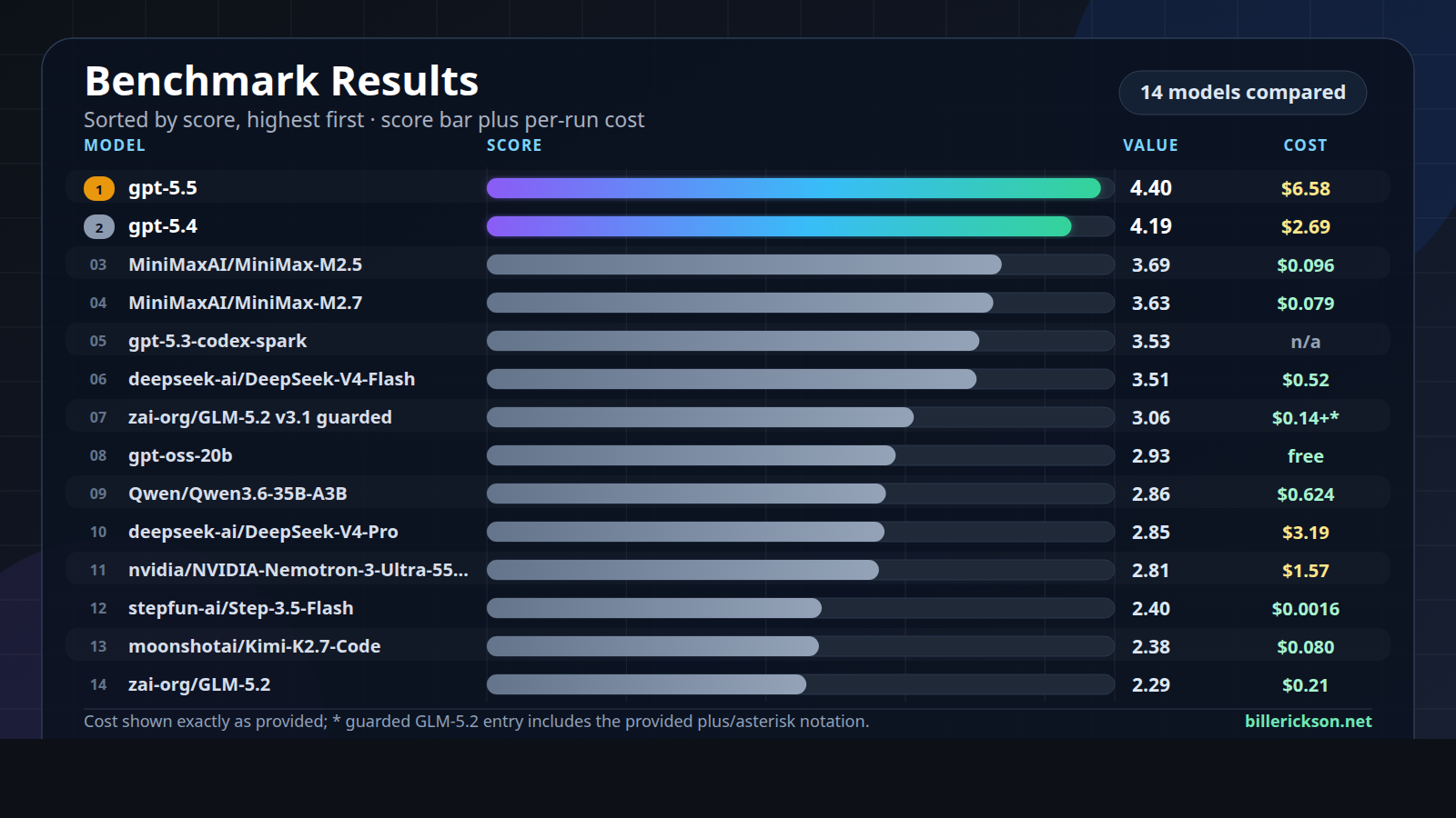
MiniMax Test
Test Details
zai-org/GLM-5.2
2.29 at an estimated cost of $0.21. It handled the brand-color lookup well after the benchmark metadata issue was corrected, but the implementation tasks exposed a persistent stall pattern. Task 2 produced some clean, narrow manifest edits but did not finish the full set, and Tasks 3 and 4 ended without meaningful implementation before operator caps.moonshotai/Kimi-K2.7-Code
2.38 at an estimated cost of $0.080. It answered the brand-color lookup accurately, but was slow for such a simple read-only task and did extra searching after finding the authoritative file. On the coding tasks, it repeatedly found the right files or target sets, then stalled without producing a usable diff before caps were reached.stepfun-ai/Step-3.5-Flash
2.40, with cost recorded as at least $0.0016 because some interrupted tasks did not emit final usage. It was fast and accurate on the brand-color lookup, but Task 2 showed serious scope-control problems. Although it changed the API version, it also removed acf.mode, added customClassName broadly, reformatted files, and kept wandering after the useful part of the edit was done.nvidia/NVIDIA-Nemotron-3-Ultra-550B-A55B
2.81 at an estimated cost of $1.57. It did well on the first two tasks: the lookup was accurate, and the ACF block API migration produced a strong final diff. However, those wins came with high token use and some malformed validation commands on the mechanical edit.deepseek-ai/DeepSeek-V4-Pro
2.85 at an estimated cost of $3.19. Its first two tasks were excellent from a final-diff perspective: accurate lookup, clean mechanical manifest updates, and good validation shape. The downside was efficiency, especially Task 2, which took about four minutes and nearly 0.9M input tokens for a straightforward file-wide version bump.Qwen/Qwen3.6-35B-A3B
2.86 at an estimated cost of $0.624. It completed the lookup correctly and did make real edits on Tasks 2 and 3, but those edits were not especially disciplined. Task 2 finished the migration but introduced unnecessary support and context changes, making the diff riskier than the clean one-line manifest updates from stronger runs.gpt-oss-20b
gpt-oss-20b averaged 2.93 and was free to run locally. It remained a useful baseline: accurate on the brand-color lookup, clean on the mechanical block.json migration, and much better behaved than several paid hosted models on artifact hygiene. It avoided backup files and did not dump compiled CSS during the footer exploration.zai-org/GLM-5.2 v3.1 guarded
3.06, with cost recorded as at least $0.14. The neutral guardrail materially improved the mechanical ACF block task: Task 2 went from incomplete in the original GLM run to a clean, correct migration. That suggests GLM’s failures were partly sensitive to task framing and agent-loop behavior, not just inability to understand the repo.deepseek-ai/DeepSeek-V4-Flash
3.51 at an estimated cost of $0.52. It was strong on the lookup and mechanical API migration, producing scoped, valid changes. Compared with V4-Pro, it was cheaper and ultimately more useful in this benchmark because it completed all four tasks and produced real implementation diffs.gpt-5.3-codex-spark
gpt-5.3-codex-spark averaged 3.53; cost was marked n/a because no official API price was available. It performed well on the lookup and mechanical manifest update, with a clean final diff on Task 2 despite some failed shell attempts and an inaccurate final file count. As with many models, the simple tasks were much stronger than the implementation tasks.MiniMaxAI/MiniMax-M2.7
3.63 at an estimated cost of $0.079. It was one of the strongest price/performance results in the benchmark. The lookup was accurate and very fast, and Task 2 produced a correct final migration with clean validation, though it initially missed the nested manifest before recovering.MiniMaxAI/MiniMax-M2.5
3.69 at an estimated cost of $0.096. It was the biggest pleasant surprise of the DeepInfra set. The model was accurate on the lookup, produced an exactly correct API-version diff on Task 2, and generally delivered useful edits at low cost.gpt-5.4
4.19 at an estimated cost of $2.69. It was strong across the first two tasks, including a sourced brand-color answer and an exact, well-scoped ACF block API edit. It spent more tokens than necessary on the simple migration, but the final work was correct and reviewable.gpt-5.5
4.40 at an estimated cost of $6.58. It was accurate and well sourced on the lookup, produced the expected tracked diff for the ACF block API migration, and avoided backup artifacts. It was not perfectly efficient, but the final outputs were consistently more useful than the rest of the field.Enable the Hermes dashboard on the remote machine
pkill -f 'hermes dashboard.*9119'cd ~/.hermes/hermes-agent
HASH=$(venv/bin/python3 -c 'from getpass import getpass; from plugins.dashboard_auth.basic import hash_password; print(hash_password(getpass("Dashboard password: ")))')
SECRET=$(openssl rand -base64 32)
cat >> ~/.hermes/.env <<EOF
HERMES_DASHBOARD_BASIC_AUTH_USERNAME=admin
HERMES_DASHBOARD_BASIC_AUTH_PASSWORD_HASH=$HASH
HERMES_DASHBOARD_BASIC_AUTH_SECRET=$SECRET
EOF
chmod 600 ~/.hermes/.envHERMES_DASHBOARD_BASIC_AUTH_SECRET matters because it keeps your desktop session valid across dashboard restarts. Without it, you’ll get logged out every time the dashboard restarts.<tailscale-ip> to your actual tailscale IP.hermes dashboard --no-open --host <tailscale-ip> --port 9119curl -s http://<tailscale-ip>:9119/api/status | jq '.auth_required, .auth_providers'true
[
"basic"
]auth_required is false, the auth gate isn’t active. If basic is missing, the dashboard did not load your username/password settings.Install Hermes Desktop locally
http://192.168.1.50:9119, but I prefer using the Tailscale IP: http://100.x.y.z:9119Why this setup is better
When Astro is a good fit
Start with an inventory
Migration Inventory.md file that described the site structure and gave the agent a concrete migration target.Create the design brief
Don’t skip the QA process
send_email binding.SEO still matters
@astrojs/sitemap for sitemap outputPageSpeed improves, but not automatically
The tradeoff is editing
My current approach
Starter theme features
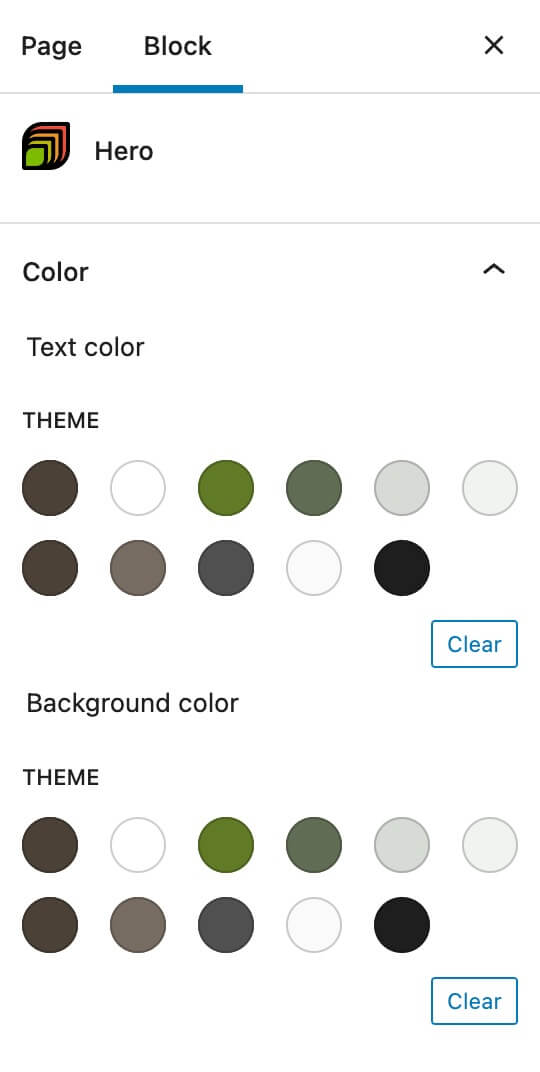
Define colors and styles with theme.json
.has-blue-background-color { color: red; }settings.custom.layout section of theme.json to set:
content is the content area width used for Content and Content Sidebar layouts. It’s also used for the content width inside of a group blockwide is the site’s max width used in the site header, site footer, the content area for the “Full Width Content” layout, and the “wide” alignment optionsidebar is the sidebar widthpadding is the left/right padding on the content areablock-gap is the space between blocks (ex: paragraphs and headings)block-gap-large is the top/bottom padding on full width groups with a background color, top/bottom margin on separator block, top/bottom padding on site-inner, and in a few other places that need a larger space than block-gap.Build custom blocks using ACF and block.json
block-{block name} if a style.css file exists in the block’s folderbackground: var(--wp--preset--color--primary);.editor-styles-wrapper so you may need to add that class on your own for editor specific styling.Block Areas for additional editable content
.block-area-{block area name} and can adjust the content width to match how it will render on the frontend, so the “Sidebar” block area is 336px wide.
settings.custom.layout.sidebar in theme.json).Block_Areas\show( $block_area_name ).SASS compiled using Node.js
npm install to install the SASS package. You can then run npm run sass-dev to automatically compile expanded CSS as changes are made to the SASS partials.npm run sass-prod which compiles minified CSS.Use
be_icon() for loading inline SVGs<svg xmlns="http://www.w3.org/2000/svg" viewBox="0 0 24 24">be_icon() function. For instance, if you want to display a 24×24 facebook icon, use be_icon( [ 'icon' => 'facebook', 'size' => 24 ] );<svg><use href="#utility-heart"></use></svg> and then loads the heart icon once in the site footer with that ID.'force' => true to skip this and load the full markup inline.Full Site Editing blocks have been removed
Login Logo
$logo_path, $logo_width, and $logo_height variables, and it will update the logo on the WP login page for you.
Summary
Create a block.json file
{
"name": "cwp/tip",
"title": "Recipe Tip",
"description": "",
"style": "file:./style.css",
"script": "",
"category": "cultivatewp",
"icon": "carrot",
"apiVersion": 2,
"keywords": [],
"acf": {
"mode": "preview",
"renderTemplate": "render.php"
},
"styles": [],
"supports": {
"align": false,
"anchor": false,
"alignContent": false,
"color": {
"text": false,
"background": true,
"link": false
},
"alignText": false,
"fullHeight": false
},
"attributes": {
}
}
Custom prefixes in block name
name you can now specify your own prefix, instead of all blocks being prefixed automatically with acf. If you don’t add a prefix, the ACF one will be used.Script
script parameter to pass the script handle: "script": "block-tip"./**
* Register block script
*/
function cwp_register_block_script() {
wp_register_script( 'block-tip', get_template_directory_uri() . '/blocks/tip/block-tip.js', [ 'jquery', 'acf' ] );
}
add_action( 'init', 'cwp_register_block_script' );window.acf.addAction) you’ll need to include acf as a dependency.render_block_preview/type=cwp/tipStyle
style parameter lets you specify a stylesheet to include with this block. There are two ways this can be used."style": "file:./style.css""style": "block-tip"wp_enqueue_style( 'block-tip' ) to load the CSS file normally, with the opposite pros/cons listed above. Elsewhere in your theme/plugin you should have wp_register_style( 'block-tip', get_template_directory_uri() . '/blocks/tip/style.css' )should_load_separate_core_block_assets filter to tell WP to only load the ones that are required, but it waits until wp_footer to load the CSS, causing big CLS issues which makes this feature useless.Script
script parameter to pass the script handle: "script": "block-tip"./**
* Register block script
*/
function cwp_register_block_script() {
wp_register_script( 'block-tip', get_template_directory_uri() . '/blocks/tip/block-tip.js', [ 'jquery', 'acf' ] );
}
add_action( 'init', 'cwp_register_block_script' );window.acf.addAction) you’ll need to include acf as a dependency.render_block_preview/type=cwp/tipIcon
"icon": "<svg xmlns='http://www.w3.org/2000/svg' viewBox='0 0 22.5 22.5'><defs><style>.a{fill:#222;}.b{fill:#1fa8af;}</style></defs><path class='a' d='M20.17,4a10.17,10.17,0,0,0-7-3.5L11.91.38h-.18a.64.64,0,0,0-.47.13A.68.68,0,0,0,11,.93L10.6,3.79a.48.48,0,0,0,.12.43.54.54,0,0,0,.44.18h.11l1.44.17c3.94.45,6.12,2.69,5.84,6a8.37,8.37,0,0,1-2.49,5.12A8.14,8.14,0,0,1,10,18.06l-.65,0H9.15a.8.8,0,0,0-.5.17.68.68,0,0,0-.25.44L8,21.5a.49.49,0,0,0,.12.42.57.57,0,0,0,.45.18h.17l1,0h.34a11.61,11.61,0,0,0,8.21-3.39,12.76,12.76,0,0,0,3.77-7.92A9.49,9.49,0,0,0,20.17,4Z'/><path class='b' d='M9.2,17h.15L10,17a7.61,7.61,0,0,0,3.64-.77L15,6.15a8.65,8.65,0,0,0-2.33-.57l-1-.12-1,7.35L9.23,7c-.11-.45-.33-.67-.65-.67H7.16c-.29,0-.5.22-.65.67L5.1,12.81,3.82,3a.55.55,0,0,0-.61-.55H.78a.36.36,0,0,0-.29.16A.6.6,0,0,0,.37,3a.5.5,0,0,0,0,.18L2.53,19.22a1.07,1.07,0,0,0,.23.6.64.64,0,0,0,.53.23H5.16c.37,0,.61-.21.73-.65l2-7.19Z'/></svg>",ACF
mode to specify how the block is rendered in the block editor. The default is “auto” which renders the block to match the frontend until you select it, then it becomes an ACF field group editor. If set to “preview” it will always look like the frontend and you can edit ACF field group in the sidebar.renderTemplate to specify what PHP file will render this block. I typically have a render.php file in each block directory for consistency.renderCallback to specify a PHP function that will output the block’s content.Styles
styles to specify an array of block type styles. "styles": [
{ "name": "default", "label": "Default", "isDefault": true },
{ "name": "red", "label": "Red" },
{ "name": "green", "label": "Green" },
{ "name": "blue", "label": "Blue" }
],Supports
supports to specify what Gutenberg features this block supports. The default is false for all items so you don’t need to specify all the items it doesn’t support, but I typically leave them all in there marked false so I can easily toggle the ones I want to true. "supports": {
"align": false,
"anchor": false,
"alignContent": false,
"color": {
"text": false,
"background": true,
"link": false
},
"alignText": false,
"fullHeight": false
},Attributes
tertiary color by default:"attributes": {
"backgroundColor": {
"type": "string",
"default": "tertiary"
}
}
Register your block
register_block_type()./**
* Load Blocks
*/
function cwp_load_blocks() {
register_block_type( get_template_directory() . '/blocks/tip/block.json' );
// Optional - register stylesheet if using Style Method 2 from above
wp_register_style( 'block-tip', get_template_directory_uri() . '/blocks/tip/style.css' );
}
add_action( 'init', 'cwp_load_blocks' );Advanced Usage
<?php
/**
* Blocks
*
* @package CultivateClient
* @author CultivateWP
* @since 1.0.0
* @license GPL-2.0+
**/
namespace Cultivate\Blocks;
/**
* Load Blocks
*/
function load_blocks() {
$theme = wp_get_theme();
$blocks = get_blocks();
foreach( $blocks as $block ) {
if ( file_exists( get_template_directory() . '/blocks/' . $block . '/block.json' ) ) {
register_block_type( get_template_directory() . '/blocks/' . $block . '/block.json' );
wp_register_style( 'block-' . $block, get_template_directory_uri() . '/blocks/' . $block . '/style.css', null, $theme->get( 'Version' ) );
if ( file_exists( get_template_directory() . '/blocks/' . $block . '/init.php' ) ) {
include_once get_template_directory() . '/blocks/' . $block . '/init.php';
}
}
}
}
add_action( 'init', __NAMESPACE__ . '\load_blocks', 5 );
/**
* Load ACF field groups for blocks
*/
function load_acf_field_group( $paths ) {
$blocks = get_blocks();
foreach( $blocks as $block ) {
$paths[] = get_template_directory() . '/blocks/' . $block;
}
return $paths;
}
add_filter( 'acf/settings/load_json', __NAMESPACE__ . '\load_acf_field_group' );
/**
* Get Blocks
*/
function get_blocks() {
$theme = wp_get_theme();
$blocks = get_option( 'cwp_blocks' );
$version = get_option( 'cwp_blocks_version' );
if ( empty( $blocks ) || version_compare( $theme->get( 'Version' ), $version ) || ( function_exists( 'wp_get_environment_type' ) && 'production' !== wp_get_environment_type() ) ) {
$blocks = scandir( get_template_directory() . '/blocks/' );
$blocks = array_values( array_diff( $blocks, array( '..', '.', '.DS_Store', '_base-block' ) ) );
update_option( 'cwp_blocks', $blocks );
update_option( 'cwp_blocks_version', $theme->get( 'Version' ) );
}
return $blocks;
}
/**
* Block categories
*
* @since 1.0.0
*/
function block_categories( $categories ) {
// Check to see if we already have a CultivateWP category
$include = true;
foreach( $categories as $category ) {
if( 'cultivatewp' === $category['slug'] ) {
$include = false;
}
}
if( $include ) {
$categories = array_merge(
$categories,
[
[
'slug' => 'cultivatewp',
'title' => __( 'CultivateWP', 'cultivate_textdomain' ),
'icon' => \cwp_icon( [ 'icon' => 'cultivatewp', 'group' => 'color', 'force' => true ] )
]
]
);
}
return $categories;
}
add_filter( 'block_categories_all', __NAMESPACE__ . '\block_categories' );
get_blocks() function scans the /block directory and makes an array of all my blocks. I store this as an option so we only have to do this once, and use the current theme’s version to bust the cache. So when I add a new block, I also bump the version number in style.css
register_block_type() using the block.json filewp_register_style() to register the block’s stylesheet. This will only load if the block.json file specifies a style.init.php file in the block directory, load that too. This is what I use for any additional PHP code I want to run independent of the block’s rendering.init hook with a priority of 5 so I can use the normal init (priority 10) inside my init.php file.acf/settings/load_json filter tells ACF to look in my block directories for ACF JSON field group files.
Need Help?
Additional information
.has-secondary-background-color will have the same background color.Add ‘color’ support
acf_register_block_type(), you can use the ‘supports’ array to specify which block editor features this block supports. The documentation lists a few examples, but the important part is All properties from the JavaScript block supports documentation may be used. 'color' => true to the supports array.acf_register_block_type(
[
'title' => __( 'Hero', 'cwp2021' ),
'name' => 'hero',
'render_template' => 'partials/blocks/hero.php',
'category' => 'cultivatewp',
'mode' => 'preview',
'align' => 'full',
'supports' => [
'align' => [ 'full' ],
'jsx' => true,
'color' => true,
],
]
);
acf_register_block_type(
[
'title' => __( 'Hero', 'cwp2021' ),
'name' => 'hero',
'render_template' => 'partials/blocks/hero.php',
'category' => 'cultivatewp',
'mode' => 'preview',
'align' => 'full',
'supports' => [
'align' => [ 'full' ],
'jsx' => true,
'color' => [
'background' => true,
'gradients' => true,
'text' => false,
],
],
]
);Add the classes to your block
$block['backgroundColor'] and $block['textColor']. $classes = [ 'block-hero' ];
if ( ! empty( $block['className'] ) ) {
$classes = array_merge( $classes, explode( ' ', $block['className'] ) );
}
if ( ! empty( $block['align'] ) ) {
$classes[] = 'align' . $block['align'];
}
if ( ! empty( $block['backgroundColor'] ) ) {
$classes[] = 'has-background';
$classes[] = 'has-' . $block['backgroundColor'] . '-background-color';
}
if ( ! empty( $block['textColor'] ) ) {
$classes[] = 'has-text-color';
$classes[] = 'has-' . $block['textColor'] . '-color';
}
printf(
'<div class="%s"%s>',
esc_attr( join( ' ', $classes ) ),
! empty( $block['anchor'] ) ? ' id="' . esc_attr( sanitize_title( $block['anchor'] ) ) . '"' : '',
);
echo '<div class="block-hero__image">' . wp_get_attachment_image( get_field( 'image' ), 'full' ) . '</div>';
echo '<div class="block-hero__content"><InnerBlocks /></div>';
echo '</div>';
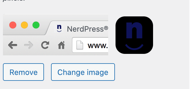
Create SVG favicon
<svg xmlns="http://www.w3.org/2000/svg" width="512" height="512" viewBox="0 0 512 512">
<path fill="#0F145B" d="......" />
</svg>fill and stroke attributes) and add those styles with inline CSS.@media ( prefers-color-scheme: dark ) to style the dark mode version differently. Here’s what my SVG now looks like:<svg xmlns="http://www.w3.org/2000/svg" width="512" height="512" viewBox="0 0 512 512">
<style>
path {
fill: #0F145B;
}
@media ( prefers-color-scheme: dark ) {
path {
fill: #43C1C5;
}
}
</style>
<path d="....." />
</svg>Add SVG favicon to your theme
/assets/images/ directory, but you can add it anywhere in your theme. /**
* SVG Favicon
*/
function be_svg_favicon() {
echo '<link rel="icon" href="' . esc_url( get_stylesheet_directory_uri() . '/assets/images/favicon.svg' ) . '" type="image/svg+xml">';
}
add_action( 'wp_head', 'be_svg_favicon', 100 );<InnerBlocks /> and use the block editor to build the content inside the block.How to use InnerBlocks
'jsx' => true in the supports array. acf_register_block_type( array(
'title' => __( 'About', 'client_textdomain' ),
'name' => 'about',
'render_template' => 'partials/blocks/about.php',
'mode' => 'preview',
'supports' => [
'align' => false,
'anchor' => true,
'customClassName' => true,
'jsx' => true,
]
));
<InnerBlocks /> where you would like the editable block area to appear. $classes = ['block-about'];
if( !empty( $block['className'] ) )
$classes = array_merge( $classes, explode( ' ', $block['className'] ) );
$anchor = '';
if( !empty( $block['anchor'] ) )
$anchor = ' id="' . sanitize_title( $block['anchor'] ) . '"';
echo '<div class="' . join( ' ', $classes ) . '"' . $anchor . '>';
echo '<div class="block-about__inner">';
echo '<div class="block-about__content">';
echo '<InnerBlocks />';
echo '</div>';
echo '<div class="block-about__image">';
echo wp_get_attachment_image( get_field( 'image' ), 'be_thumbnail_l' );
echo '</div>';
echo '</div>';
echo '</div>';
Default value for InnerBlocks
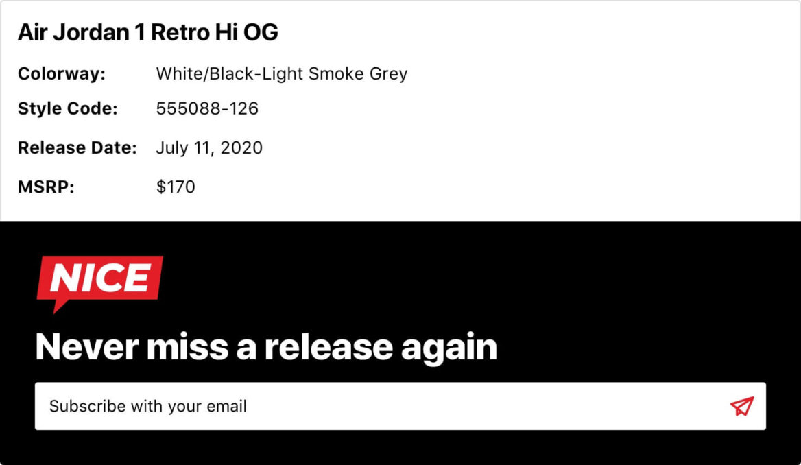
$template array detailing which blocks should be added. Update <InnerBlocks /> to include the template.$template = array(
array('core/heading', array(
'level' => 2,
'content' => 'Title Goes Here',
)),
array( 'core/paragraph', array(
'content' => '<strong>Colorway:</strong> <br /><strong>Style Code:</strong> <br /><strong>Release Date:</strong> <br /><strong>MSRP:</strong> ',
) )
);
echo '<div class="' . join( ' ', $classes ) . '"' . $anchor . '>';
echo '<InnerBlocks template="' . esc_attr( wp_json_encode( $template ) ) . '" />';
$form_id = get_option( 'options_be_release_info_form' );
if( !empty( $form_id ) && function_exists( 'wpforms_display' ) )
wpforms_display( $form_id, true, true );
echo '</div>';

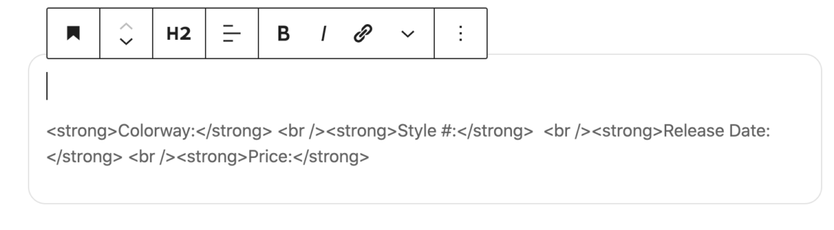
Placeholders instead of default content
placeholder parameter to specify placeholder text. This will not be published, and when you select the field the placeholder text disappears.<strong> and <br /> to format the paragraph text, but that doesn’t work with the placeholder.$template to $template = array(
array('core/heading', array(
'level' => 2,
'placeholder' => 'Title Goes Here',
)),
array( 'core/paragraph', array(
'placeholder' => '<strong>Colorway:</strong> <br /><strong>Style #:</strong> <br /><strong>Release Date:</strong> <br /><strong>Price:</strong> ',
) )
);
Limit the blocks available in InnerBlocks
allowedBlocks attribute. $allowed_blocks = array( 'core/heading', 'core/paragraph' );
$template = array(
array('core/heading', array(
'level' => 2,
'content' => 'Title Goes Here',
)),
array( 'core/paragraph', array(
'content' => '<strong>Colorway:</strong> <br /><strong>Style Code:</strong> <br /><strong>Release Date:</strong> <br /><strong>MSRP:</strong> ',
) )
);
echo '<div class="' . join( ' ', $classes ) . '"' . $anchor . '>';
echo '<InnerBlocks allowedBlocks="' . esc_attr( wp_json_encode( $allowed_blocks ) ) . '" template="' . esc_attr( wp_json_encode( $template ) ) . '" />';
$form_id = get_option( 'options_be_release_info_form' );
if( !empty( $form_id ) && function_exists( 'wpforms_display' ) )
wpforms_display( $form_id, true, true );
echo '</div>';
Template lock with InnerBlocks
templateLock="all" prevents inserting new blocks or removing/re-arranging current blockstemplateLock="insert" prevents inserting new blocks or removing current blocks, but you can re-arrange the current blocks.
templateLock="all" so only the heading from my block template could be used in this block.$classes = ['block-icon-heading'];
if( !empty( $block['className'] ) )
$classes = array_merge( $classes, explode( ' ', $block['className'] ) );
if( !empty( $block['align'] ) )
$classes[] = 'align' . $block['align'];
$anchor = '';
if( !empty( $block['anchor'] ) )
$anchor = ' id="' . sanitize_title( $block['anchor'] ) . '"';
$template = array(
array('core/heading', array(
'level' => 2,
'content' => 'Heading',
)),
);
echo '<div class="' . join( ' ', $classes ) . '"' . $anchor . '>';
$icon = get_field( 'dynamic_icon_category' );
if( !empty( $icon ) )
echo '<div class="icon-heading-wrap">' . be_icon( [ 'icon' => $icon, 'group' => 'category', 'size' => 38 ] ) . '</div>';
echo '<InnerBlocks template="' . esc_attr( wp_json_encode( $template ) ) . '" templateLock="all" />';
echo '</div>';
searchform.php file in the theme, ensuring the Search block matches the design and functionality of the search form used everywhere else in the theme.Enqueue block editor assets
enqueue_block_editor_assets hook to load scripts and styles into the block editor. My themes typically have an editor.js file that I use for block styles and unregistering block types. /**
* Gutenberg scripts and styles
*
*/
function be_gutenberg_scripts() {
wp_enqueue_style( 'theme-fonts', be_theme_fonts_url() );
wp_enqueue_script( 'theme-editor', get_template_directory_uri() . '/assets/js/editor.js', array( 'wp-blocks', 'wp-dom' ), filemtime( get_template_directory() . '/assets/js/editor.js' ), true );
}
add_action( 'enqueue_block_editor_assets', 'be_gutenberg_scripts' );
/**
* Theme Fonts URL
*
*/
function be_theme_fonts_url() {
return 'https://fonts.googleapis.com/css2?family=Roboto+Slab&display=swap';
}
Unregister block type
wp.blocks.unregisterBlockType to unregister block types. wp.domReady( () => {
wp.blocks.unregisterBlockType( 'core/media-text' );
wp.blocks.unregisterBlockType( 'core/search' );
} );Unregister blocks everywhere