What is CSS Grid?
CSS Grid is a new layout system in CSS. It’s not a framework or library like Bootstrap – it’s built right in.
It allows you to take an element on the page and turn it into a “grid” of columns and rows. All of that item’s direct descendants will be “grid items” and placed within those columns and rows.
It’s not a replacement for Flexbox or floats, but an additional tool that works great in certain contexts. Here’s an article that goes into more detail about when to use Flexbox or Grid.
How it works
Let’s start with a simple example. I’m setting up a grid with three columns and three rows, each with a width and height I’ve defined.
.grid1 {
	display: grid;
	grid-template-columns: 50px 100px 150px;
	grid-template-rows: 150px 100px 50px;
	grid-gap: 20px;
}
Each grid item takes up one spot in the grid, and is sized based its row and column. Grid items can be any HTML element (div, paragraph, image…) as long as its the direct descendant.
If you don’t specify a column or row size, it will automatically be sized based on the tallest or widest element in that column / row, respectively.
Implicit vs Explicit Grid
The grid made up of rows and columns you have specified is called the explicit grid. In the example above, we defined a 3-row by 3-column explicit grid.
If you add more items than there are slots in the explicit grid, the browser adds additional rows which are called the implicit grid. Here’s the same example from above but with more grid items:
.grid2 {
	display: grid;
	grid-template-columns: 50px 100px 150px;
	grid-template-rows: 150px 100px 50px;
	grid-gap: 20px;
}

.item {
	min-height: 40px;
}
The height of the implicit grid rows is determined by the tallest element inside the row. In this case, we have a minimum height of 40px on the grid items so the implicit grid rows are 40px.
You can also specify the height of the automatically added rows using grid-auto-rows.
.grid3 {
	display: grid;
	grid-template-columns: 50px 100px 150px;
	grid-template-rows: 150px 100px 50px;
	grid-gap: 20px;
	grid-auto-rows: 100px;
}

.item {
	min-height: 40px;
}
Units
You can use any CSS units you’d like when building your grid, including pixels, rems, and percentages.
But be careful with percentages – you can easily overflow the grid if you try to add everything up to 100%. You have to consider grid gaps.
.grid4 {
	border: 2px solid black;
	display: grid;
	grid-template-columns: 75% 25%;
	grid-gap: 20px;
}

.item {
	min-height: 40px;
}
If you are using percentages, use auto for one of the values.
.grid5 {
	border: 2px solid black;
	display: grid;
	grid-template-columns: 75% auto;
	grid-gap: 20px;
}

.item {
	min-height: 40px;
}
Fractional Units
A better approach is to use fractional unit, fr, a new unit added specifically for the grid. This is essentially a “free space” unit and lets you divide the remaining free space based on proportions you define.
Here’s a simple 3 column grid:
.grid6 {
	display: grid;
	grid-template-columns: 1fr 1fr 1fr;
	grid-gap: 20px;
}
You can change the proportions by changing the number of fractional units assigned to each column.
.grid7 {
	display: grid;
	grid-template-columns: 1fr 2fr 1fr;
	grid-gap: 20px;
}
Free space is calculated after determining the minimum amount of space required for all grid items. Even if you have proportional columns, if one of the grid items is larger than the others it could change the column widths.
In the below example I’m making the second grid item 300px wide which affects the entire column.
.grid8 {
	display: grid;
	grid-template-columns: 1fr 1fr 1fr;
	grid-gap: 20px;
}

.grid8 .item:nth-child(2) {
	width: 300px;
	background: #00aa37;
}
Repeat
The repeat() function helps simplify repetitive CSS. For a 6 column grid, instead of typing 1fr 6 times you can use repeat( 6, 1fr ).
.grid9 {
	display: grid;
	grid-template-columns: repeat( 6, 1fr );
	grid-gap: 12px;
}
Spanning multiple columns
By default, every grid item takes up one column and one row. You can adjust a grid item’s column using the grid-column parameter, and adjust the grid item’s row using grid-row.
In this example we’re going to make the second item take up two columns.
.grid10 {
	display: grid;
	grid-template-columns: repeat( 4, 1fr );
	grid-gap: 20px;
}

.grid10 .item:nth-child(2) {
	grid-column: span 2;
	background: #00aa37;
}
You can also use this field to specify the starting and/or ending point for the grid item. The above could be rewritten as:
.grid11 {
display: grid;
grid-template-columns: repeat( 4, 1fr );
grid-gap: 20px;
}
.grid10 .item:nth-child(2) {
grid-column: 2 / 4;
background: #00aa37;
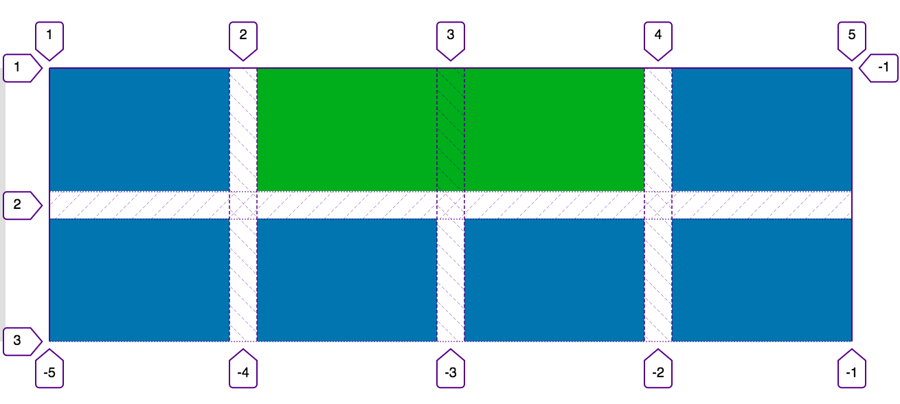
}The numbers don’t represent the columns but rather the dividing lines between the columns. An item in the first column would be grid-column: 1 / 2 because it spans from the first to the second line.
Firefox has a great grid inspector built-in that makes this easier to understand. Here’s a screenshot of the grid in the above example.
Full width grid items
You can use negative numbers to count from the other direction. grid-column: 1 / -1 makes an element span the entire width of the grid, regardless of the number of columns. I like to use this for elements that appear at the top and bottom of a grid.
It’s also useful if you’re changing the number of columns used at different breakpoints. If you specified a specific start and end like grid-column: 1 / span 5 , you would need to change it to grid-column: 1 / span 4 at the breakpoint where you drop the columns by one.
Let’s say you have an archive of posts. You might have the following markup, with <header> for the page title, <article> for the individual posts, and <nav> for the pagination at the bottom.
.grid12 {
	display: grid;
	grid-template-columns: repeat( 3, 1fr );
	grid-gap: 12px;
}

@media only screen and (max-width: 767px) {
	.grid12 {
		grid-template-columns: repeat( 2, 1fr );
	}
}


.grid12 header,
.grid12 nav {
	background: #f0f0f0;
	grid-column: 1 / -1;
	text-align: center;
}

.grid12 article {
	font-size: 12px;
	color: #fff;
	padding: 4px;
}
Category name goes here
Alignment
By default, the grid makes all grid items in the same row have the same height, which is either determined by the explicit row height or the height of the largest item. See the examples above to see how grid items all have matching heights.
You can adjust the grid item alignment on the column axis using align-items. The possible values are: start, end, center, and stretch (default). You can adjust the grid item alignment on the row axis using justify-items, with the same values as above.
Both of these parameters are added to the grid itself and apply to all grid items. You can adjust an individual grid item’s alignment using align-self and justify-self.
Take a look at the Complete Guide to Grid for visual examples of all these options.
.grid13 {
	display: grid;
	grid-template-columns: repeat( 2, 1fr );
	grid-gap: 12px;
	align-items: center;
}
This grid item is smaller and centered.
Lorem ipsum dolor sit amet, consectetur adipiscing elit. Quid enim tanto opus est instrumento in optimis artibus comparandis? Ut placet, inquit, etsi enim illud erat aptius, aequum cuique concedere. Dolor ergo, id est summum malum, metuetur semper, etiamsi non aderit; Et quidem iure fortasse, sed tamen non gravissimum est testimonium multitudinis.
Browser Compatibility
As of September 2018, CSS Grid is supported globally by 87.25% user’s browsers (see here). For comparison, Flexbox has 95% coverage.
It might be even higher on your specific site. 97% of visitors to billerickson.net support CSS Grid (see here). Here’s how to determine feature support for your website.
When determining what CSS features to use, it’s important to consider:
- Your actual users and what their browsers support.
- If CSS Grid isn’t enabled, how will it affect a user’s ability to browser your site.
If you’re using the grid for vertical alignment or showing a bulleted list in multiple columns, losing the grid won’t negatively affect the user experience too much. In these cases where it’s a visual enhancement but not structurally important, I recommend writing your CSS using only grid.
For absolutely essential aspects of your site, like ensuring your content area and sidebar appear next to each other, it’s a good idea to include fallback CSS for browsers that don’t support grid.
You can use @supports( display: grid ) to see if a browser supports grid. I’ll do my non-grid, typically float-based styling first, then if the browser supports grid I’ll undo those styles and apply my grid styling. They won’t exactly match but the non-grid styling will ensure the site is still functional. Here’s an article I wrote that goes into more detail about Using CSS Grid with IE Fallback.
.grid14 {
	overflow: hidden;
	width: 100%;
}

.grid14 .item-content-area {
	float: left;
	width: 70%;
}

.grid14 .item-sidebar {
	float: right;
	width: 20%;
}

@supports( display: grid ) {
	.grid14 {
		display: grid;
		grid-template-columns: 1fr 200px;
		grid-column-gap: 16px;
	}

	.grid14 .item-content-area,
	.grid14 .item-sidebar {
		float: none;
		width: 100%;
	}
}More Resources
I highly recommend you take Wes Bos’ completely free course on CSS Grid. It provides hands-on tutorials to work through as he illustrates the new features of CSS Grid. With 4 hours of content across 25 videos, you could knock it out in a day, or spread it out over a week or month.
I also recommend keeping CSS Tricks’ Complete Guide to Grid bookmarked because you’ll be referring to it often.