Photo by @kranderson
I just got back from Copyblogger’s first conference, Authority Intensive 2014. What a blast. I walked away with a bunch of actionable items for my website and business, and some new friends.
I think there’s two elements that made this the best conference I’ve ever attended:
- The curation of talks by Brian Clark. All the talks went well together, tying together without rehashing what another covered. There was a logical progression through them all. It was like taking a course on how to succeed online.
- The diversity of the audience. Everyone was passionate, but came from all different industries and types of businesses. I had great discussions with people from GE and LinkedIn, very successful bloggers, and lawyers trying to figure out this whole content marketing thing for their industry. It was the right size as well, about 400 attendees. This was large enough to have different people to speak with at all the parties and in the hallways, but small enough for the conference to feel fairly intimate.
If you missed out this year, sign up now for Authority Intensive 2015. I’m sure it will sell out quickly like the last one did.
I was honored when Brian Clark asked me to speak at the conference. And then I found out I was speaking after Seth Godin, which made it the most nervous I’ve been for a talk. But everyone seemed to like it, so it was worth all the preparation.
The way @BillErickson is explaining responsive design is one of the clearest explanations I've heard. #authority2014
— Tony D. Clark (@nestguy) May 8, 2014
You can view the slides here. Since they are mostly screenshots, I figured a blog post walking through my presentation would be the most useful way to share it.
The audience for this talk is business owners, not developers. My goal was to provide a working knowledge of these technologies so that when they buy a theme or hire a developer, they know what questions to ask and can see if it actually works.
Web Design Buzzwords: Here’s How They Translate Into Dollars
I’m Bill Erickson, and I’m a WordPress Engineer.
I’ve been developing websites for businesses and universities for about ten years now, eight of those years using WordPress.
The web was simpler ten years ago. Most businesses had a static HTML site. Web design was still young. WordPress was just started.
Over the next few years, companies shifted from needing a website to needing a website they could manage. WordPress matured and turned into a great content management system.
The pace of change hasn’t slowed though. In the past few years we’ve seen a lot of new technologies emerge. I’m going to review three elements that should be a part of any website built today: Responsive Design, HTML5, and Schema.
Responsive Design
Before the web, there was print. One of the key characteristics of print design is a fixed canvas. Everyone will see it exactly as you designed it.
When it comes to the web, many designers use the same approach. Some things are different – using CSS instead of images, long pages that scroll rather than trying to fit everything into one screen. But for the most part, the key characteristic is the same: the designer is designing for a single device, a single view.
When used on tablet or mobile, it isn’t an optimal experience. The site shows up small and you must zoom in to see it. But even when this is fixed, design approaches that work on a large screen with a mouse don’t always apply to a small screen with a finger.
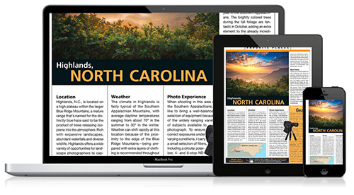
Responsive design is different. Responsive design is device agnostic. It ensures your website’s content is accessible and looks great on all devices. Not just one device, and not just desktop and mobile.
Responsive design future proofs your website. Since it works well at every possible screen resolution, it will look great on whatever new device comes out next. You want your website to be effective on every device that exists now and in the future. You don’t want to spend money designing and developing a website that quickly becomes obsolete.
Responsive design is the way the web is intended to be consumed. Even on desktop, there’s a wide range of screen sizes. You don’t want your site to only work well on large screens, or sacrifice a lot of screen real estate making it small for the few using smaller screens.
Web design is canonical. That means you’ll have a single URL your content is always accessible from. How many times have you been on Facebook or Twitter and someone shares an article. You click it, and since they shared from a mobile device you end up on the mobile version of the article. The design is stripped away, it’s one long and narrow page of content. Or even worse, their site notices you’re not a mobile device and then redirects you to the homepage, so you never actually end up reading the article. Since your mobile site and desktop site are the same, your users will never have this issue.
Responsive design is affordable. It really doesn’t take much additional work to make a site responsive, as long as you design for responsive to begin with. Compared to maintaining a separate mobile solution like a mobile website or app, you’ll have large cost savings both in initial development and ongoing maintenance.
Responsive Design Techniques
I’ve described why your site should be responsive. Now I’ll show you some of the tools developers like me use to make your site responsive.
- Percentage Widths
In the old days we might say the content area is 600px wide and the sidebar is 300px wide. Now we’ll say the content area is 60% wide and sidebar is 30% wide. So at different resolutions, the elements always fit on the screen and maintain their proportionality. - CSS Targeting Browser Widths
When you’re using the above technique, you’ll find a point where things just don’t look right. The sidebar will get too small to be usable. We can write CSS that targets specific browser widths, like less than 750px wide, and tell it to do something. We might make the content and sidebar go full width and stack on top of each other. We also might change out the normal site menu for something that works better on a touch screen. - CSS targeting pixel density
Most computers have the same screen resolution, 72 dots per inch (dpi). But tablets and mobile phones typically have higher resolution screens. So if you make an image that looks good at 72dpi, on a mobile phone it will look blurry. For important images like your website’s logo, we can use CSS to switch to a higher resolution image on high resolution devices, so your logo always looks great. - Browser Detection
The above techniques use CSS, which simply controls the look and feel of what’s already on the page. Sometimes you might want to change what shows up on the page. Let’s say you have a large rotator on your homepage that cycles through your services. On a mobile device the images are too small and no one is going to sit there and watch them cycle through. More importantly, all those large images are loading, slowing down how fast your site loads on the phone. So we can use simple tools like wp_is_mobile() in WordPress to prevent elements from loading on mobile devices, or replace them with separate mobile content, like a bulleted list of your services.
As a developer, these and other tools at my disposal. But the biggest problem I see with projects I work on is that responsive design isn’t discussed until it gets to me, the developer. It’s an afterthought. The designer is still thinking with that print design mindset. They provide me with a Photoshop file of the desktop view. The client says “oh and make it responsive,” as if there’s a checkbox I can click that makes your site responsive.
If you’re like me, mobile and tablet visitors make up about half of your traffic. Do you really want a developer designing how your site looks to 50% of your visitors? Of course not, that’s why you hired a designer.
Responsive design needs to be discussed at the very beginning of your project, and considered at every stage. When selecting a designer and developer, don’t just look at the pictures they include in their portfolio. Actually load those sites on your phone and tablet to see how well they work, and how the design and brand are conveyed across devices. Ask questions about how this or that element might need to be changed for a smaller screen. And most importantly, make sure there’s communication between your designer and developer. When the developer is building out the website, there will be design issues that just weren’t considered in the design phase. This is normal. The designer needs to available and willing to see the project until launch – not just deliver Photoshop files and be done.
Some designers have started doing “browser based design”. Instead of using Photoshop, they actually write the HTML/CSS themselves so we can see the design in the browser on all devices, seeing exactly how the designer intends it to work in those environments. This is great, but most designers aren’t coders.
It’s not necessary for a designer to write code to communicate their design.
On some projects my designers will provide design files of each page for desktop, tablet and mobile. On others, they’ll design desktop, tablet and mobile for one page and just desktop for the others. On others, they’ll provide designs for desktop and wireframes for tablet and mobile. What matters is they’ve considered how the site will respond and have communicated that to me, the developer.
HTML5
If your website were a house, CSS would be the paint on the walls, and HTML would be the walls themselves. HTML is how we structure the content of your site, describing what the different parts are and how important they are.
HTML5 is just the latest version of HTML. The last one, HTML4, was released in 1997. The internet has changed quite a lot since then, so it only makes sense that we’d expand the tool used to describe content on the web.
HTML5 isn’t completely new. It’s evolutionary. HTML5 adds more tools we can use to describe your content. This serves two purposes:
- Browsers can better display and interact with your website.
- Search engines can better understand your site’s content
When discussing HTML5, a lot of people go into all these great new features that allow building app-like experiences on the web. While that’s definitely a big component, I’m going to walk you through the more basic elements, the types of things that will be used on most websites built today.
Semantic HTML Tags
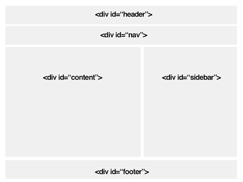
Before HTML5, this is what the code of most websites looked like. We’re using the exact same HTML element, a <div> tag, to describe everything. And while it looks like there’s some semantic information in there through IDs and Classes, these are just words the developer uses to target those elements with CSS. There’s no consistency between sites. You could just as easily call the header “site-header”, “head”, “top”, or whatever else you choose to use.
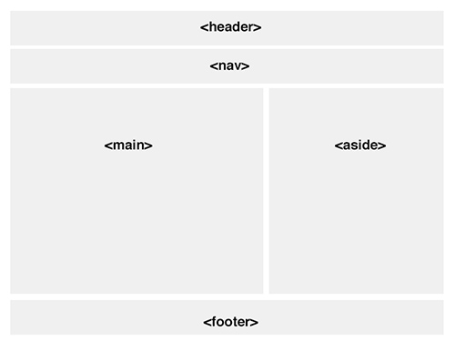
With HTML5, we get unique elements for these common pieces of a site. Now search engines know that bunch of links is actually your site navigation, and can tell which part of the content is important and which is just your sidebar.
Media Tags
Back when HTML4 was finalized, the web was still mostly text content. Nowadays media plays a huge role in the web. But it hasn’t been easy to add. You’d need to get the code for a custom video player, add Javascript or Flash to your page so it works, and hope it works well on all the devices your users are using.
Now we have <audio> and <video> tags. You simply specify the files and let the browser take care of the player. And since the browser is device-specific, it can optimize the design for that device. A desktop video player will have all the buttons around the outside. On a mobile device, you’ll get a fully immersive video experience, with the play and pause buttons fading away once the video starts.
Finally, text inputs have received a refresh. The benefit here is most readily seen on mobile devices, so I’ll be using screenshots. Your average contact form will have a bunch of fields, but most of them are just text inputs. With more context, the browser could interact with them better.

If you use an input type of “tel”, the browser knows you’re looking for a phone number. On mobile devices, the keyboard will change to a number input, so you don’t have to go to that second screen to hunt for numbers.
You’ll also notice a placeholder in that screenshot. In the past we’d have to use Javascript or CSS to simulate a placeholder. Set the value of the field to “Phone Number” and when a user clicks the field make it delete the value. Now that’s built right in. When making an input, you just include placeholder=”Phone Number” and the browser takes care of it for you.
There’s also built-in support for required fields now. In the past we’d also need custom Javascript to make sure people filled out the required fields. Now the browser can take care of that, and display error messages that work best for the device being used.
Schema
So responsive design makes your site look great on all devices. HTML5 provides browsers and search engines a better description of the elements on your page. What role does Schema play? Schema goes into even more detail about your sites for search engines.
Schema is a form of structured data, or microdata. It’s extra code you add to your site to provide context for search engines and browsers. Schema.org has established a standard that’s recognized by all the search engines and many other services. So when I say Schema, I’m referring to the microdata format described on Schema.org.
Let’s say your site has product reviews. HTML5 will tell Google which part of you page is the important content (as opposed to header, sidebar, and footer). Schema will tell Google that this is a review of a specific product, and how you rated it. And even better, Google will use this data to format how that page looks in its search results. It will provide more information about your page than others, and you’ll stand out from the crowd.
It’s not just search engines that use this. Pinterest uses the schema data when pinning items, and I’m sure more sites will utilize it. Any time a website or service needs to know information about your page, Schema is much easier than trying to figure out what your site is about on their own.
I’m not going into the technical details on implementing schema. At the end I’ll list some themes and plugins that help. But right now I’m going to walk you through a few use cases that benefit from Schema.
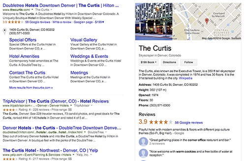
I’ll start by searching for this hotel. The first thing I notice is the right half of the page is full of information about The Curtis. When Google knows your business and location, it can display its Knowledge Graph on the right side of search results. This information also shows up on Android phones and tablets using Google Now. It knows this information because you have that on your website, marked up with specific code that tells Google what it is. Your phone number, address… all the important information about your business is described in a specific way to Google.
On the left side, it shows the average rating and number of reviews on Google Plus. This isn’t Schema, this is just Google’s data. But if you look at the next search result, TripAdvisor shows its ratings. This is schema. This is ratings from TripAdvisor’s website, and they formatted it in a way that allowed Google to recognize the ratings and display them along with the search result.
If you had an ecommerce site where you let users leave reviews of products, by structuring the information with the correct Schema information your search results could include star ratings like this as well.

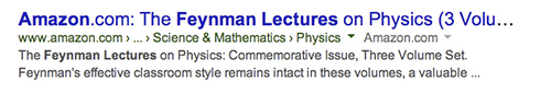
It’s not limited to collections of reviews. If you write a blog post reviewing a specific product or service and gave it a rating, your rating can show up in the listing.
Results can include breadcrumbs as additional links to your site. They can then jump straight to those sections. This is useful if you have a lot of deep content, or an ecommerce site with hierarchical categories.

Pages that list events can have those events displayed in the search results, with their location, time and description. You can use this as a speaker, or if you’re a venue you can highlight what events are upcoming.
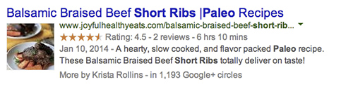
Finally, recipes are another great area for schema markup. It includes a picture of the food, any reviews people have left on the recipe, and the cook time.
The search results are just one visible way where Schema microdata helps your site. More importantly, it gives search engines better information about you, your website, and each page of content. With more knowledge, it can serve better search results.
If Google knows someone is looking for a recipe, it will show things it knows are recipes before any other matches. The more structured data you can provide Google, the better it can send targeted traffic your way. And over time, Google will use the Schema data in more ways. We’ve already seen it with Google Now on mobile devices and Google Glass.
Schema Resources
- Genesis Framework and Microdata Manager
- Yoast: WordPress SEO, Local SEO, Video SEO…
- Schema Creator Plugin
- Schema.org
- Google Structured Data Testing Tool
- Google Rich Snippet Types
Summary
I’ve reviewed three elements that should be part of any website built today. Responsive Design, HTML5, and Schema. The common thread is they future proof your website, so you won’t have to modify or rebuild as technology changes.
Responsive design allows you to have a single site that works well on all devices. The arrangement of content on the page adjusts to fit the screen. On touch screens, the menu uses a touch interface rather than hovering for submenus. On high resolution devices your logo and other images also show up in high resolution. So next year, when there’s a new Apple product that everyone wants to support, your site will already support it.
HTML5 provides a much-needed refresh of the HTML elements available to us. This allows browsers to better understand the elements on your page and provide users the correct interface to interact with them.
Schema provides even more information to search engines about your content, so Google share your pages with targeted users and present those results in a useful way.
Thank you
Richard Buff says
That’s an excellent, very clear breakdown of a pretty complicated/broad topic. What other conferences/WordCamps/etc are you attending this year?
Bill Erickson says
I don’t think I have any more conferences planned for a while. I usually do WordCamp Austin, Pressnomics, and one or two others each year.
WC Austin was a few weeks ago, and when I get a chance I’ll be writing a post walking through that one as well. Here’s my slides for that one
Richard Buff says
Awesome. I’ve been wanting to make time to look over your calendar code. I’m planning on attending Pressnomics this year as well.
Joshua Nelson says
Bill,
Great post, that sounds like quite the conference! I look forward to the events calendar posting – I can already tell by the code that I will be singing your praises in the future. Well done!
Joshua