Genesis comes pre-built with a great bit of CSS called Column Classes. This allows you to easily make multiple columns of content with a bit of CSS. You can also add this to any theme with this CSS.
There’s two different ways I set up client sites to use this:
- Adding Editor Styles
- Div Shortcode Plugin
Adding Editor Styles
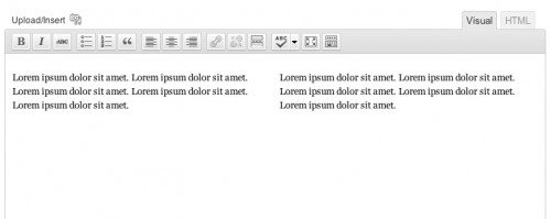
If the client is somewhat comfortable with HTML – she’s not afraid to click the “HTML” tab in the editor – then I’ll add the column classes to the editor’s stylesheet. This will make it so the columns are visible in the editor and the client can easily see where the content she’s writing will show up. I also recommend using the fullscreen editor when using this because the inline one is a bit too small.
In your theme, create a file called editor-style.css and add the column class CSS styles to it. You can also add any other styles you’d like reflected in the editor (I often add the headlines styles so the client can visually see how her h2’s and h3’s will look from the editor).
Then, add this to your functions.php file: add_editor_style( 'editor-style.css' );.
That’s it! Now when editing a post, switch to HTML view and add this:
| <div class="one-half first"> | |
| Lorem ipsum dolor sit amet. Lorem ipsum dolor sit amet. Lorem ipsum dolor sit amet. Lorem ipsum dolor sit amet. Lorem ipsum dolor sit amet. | |
| </div> | |
| <div class="one-half"> | |
| Lorem ipsum dolor sit amet. Lorem ipsum dolor sit amet. Lorem ipsum dolor sit amet. Lorem ipsum dolor sit amet. Lorem ipsum dolor sit amet. | |
| </div> |
When you switch back to Visual view, your editor should look like this:
Div Shortcode Plugin
For those who get completely lost in the HTML tab, I have a plugin that let’s them use [[div]] shortcodes. Once Div Shortcode Plugin is activated, they just have to write something like this in the Visual Editor:
| [div class="one-half first"] | |
| This is the left column | |
| [end-div] | |
| [div class="one-half"] | |
| This is the right column | |
| [end-div] |
The benefit here is that they can see exactly where in the Visual editor one column is ending and another is beginning. They’re able to control div’s without ever switching to the HTML view (where they might get lost).
Other Notes
When building out a site, I’ll often create two sample pages using each technique so the client can choose which is best for her.
If every page will have the same number of columns, you might consider pre-populating the content area with default text. This way they never have to switch to HTML mode to create the columns – they are there already.
It looks like a future version of Genesis might include icons in the TinyMCE Editor for creating the columns, which will give you one more way for doing this.

Pelle says
It works now I copied 2 columns code into style.css
Thanks!
Maria says
Dear Bill,
Is there a way to leave an earlier column empty without the content of a later column moving back? – I am having the same issue as Vinicius (just a couple posts above). Is the post after that a work around? (The side by side widgets with assigned classes.) If yes, how do you assign classes that way?
Millions of thanks
Maria
Bill Erickson says
You could try adding this to the CSS file:
.one-half, .one-third, .one-fourth, .one-fifth, .one-sixth { min-height: 1px; }Peter Jensen says
I am using Genesis with the Agency child theme. I was unable to get this to work. I have three columns in a webpage which renders correctly in the browser, but they remain stacked in the editor even though I followed instructions. I hope you can shed some light on this. Thanks!
https://gist.github.com/anonymous/fa7c8e84b41e7e66ef8452d5de92c3db
Peter Jensen says
Hi Bill,
Please forget my previous comment (and this one). I found the error.
It seems a closing tag is required **/ on a comment line. I thought a line break was enough. My bad. Thanks!
Rebecca Simmons says
This works very well, except that I’m having trouble getting the text beneath the columns to line up correctly after my last div tag. When I use the following code (see below) the text below the columns lines up like this: https://biomed21.org/about-us/new-centre-established-in-india-for-human-biology-centric-research/
If I throw an extra in there an extra space is added: http://biomed21.org/about-us/non-animal-models-research-human-respiratory-tract-disease/
What am I doing wrong?
Bill Erickson says
You need to clear the float. On the first paragraph after the two columns, wrap it in
<div class="first">to clear it. Or you could add the class to the paragraph itself (<p class="first"<)Example: https://cl.ly/46f6f48a33df
Linda says
Hi Bill,
I know this is an older post, and that Columns in Blocks do this now. But inside the blocks, moving the content on a regular basis is absolutely hell, and so I’m going back to this way of displaying Maker Profiles for a collective I’m doing a site for, that will be adding and deleting makers regularly, as its easier to manage. It’s not looking great on mobile though, and I’m wondering what I add to make the columns stack on top of each other in mobile, or is it even possible at all? If it’s not possible, I won’t keep digging!
Thank you.
Linda
Bill Erickson says
You could wrap all of the column class CSS in a media query so it only applies to screens greater than 767px, or wherever you would like to draw the line.