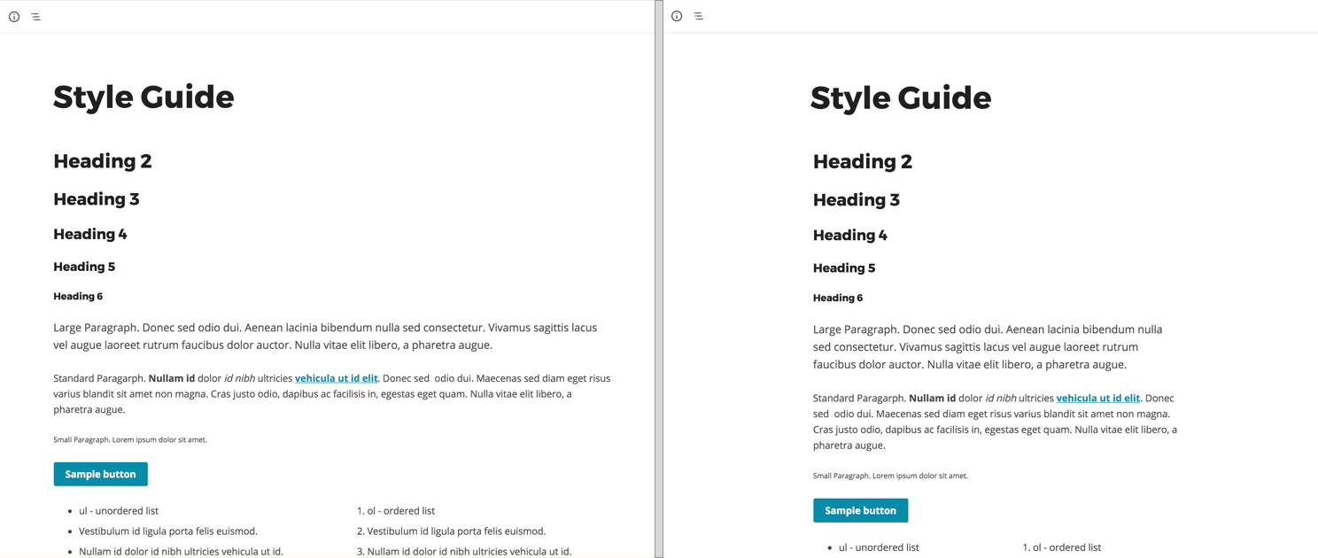
I try to make the Gutenberg block editing experience match the frontend as close as possible. It’s much easier to see how the content flows when the editor accurately represents the frontend.
Here’s how I set the default block width. But what if your theme includes different layouts with different content widths?
I’m working on a Genesis site that includes Content Sidebar, Sidebar Content, and Full Width Content layouts. The editor for Full Width Content should be wider than the ones with a sidebar.
This same concept can apply to any theme using page templates or post meta to define different layouts. My example below focuses on applying it to Genesis. Genesis lets you set a site-wide default layout, and you can change the layout on a per-post basis in a metabox below the editor.
Setting a body class
You can use the admin_body_class filter to add additional body classes to the WordPress backend. It works a little bit differently than the post_class and body_class filters – the $classes parameter is a space-separated string, not an array.
The WordPress documentation recommends adding a space before and after the classes you add to prevent accidental concatenation between classes.
I’ll use get_current_screen() to see if I’m currently in the block editor. If not, I’ll return the classes early.
I’ll then check for a Post ID which is passed as a GET variable in the URL. If it exists (we’re editing an existing post/page), I’ll check for a post-specific layout using the Genesis function genesis_get_custom_field().
If you’re not using Genesis, you can use get_post_meta() or get_page_template_slug() depending on how your theme stores the layout.
If the current post doesn’t have a layout specified, it’s using the site-wide default. I retrieve that using genesis_get_option().
Since I changed the default layout for pages to be full-width-content (see the ea_full_width_pages() function at the end), I also add this logic to my Gutenberg layout function.
/**
 * Gutenberg layout class
 * @link https://www.billerickson.net/change-gutenberg-content-width-to-match-layout/
 *
 * @param string $classes
 * @return string
 */
function ea_gutenberg_layout_class( $classes ) {
	$screen = get_current_screen();
	if( ! $screen->is_block_editor() )
		return $classes;

	$layout = false;
	$post_id = isset( $_GET['post'] ) ? intval( $_GET['post'] ) : false;

	// Get post-specific layout
	if( $post_id )
		$layout = genesis_get_custom_field( '_genesis_layout', $post_id );

	// Pages use full width as default, see below
	if( empty( $layout ) && 'page' === get_post_type() )
		$layout = 'full-width-content';

	// If no post-specific layout, use site-wide default
	elseif( empty( $layout ) )
		$layout = genesis_get_option( 'site_layout' );

	$classes .= ' ' . $layout . ' ';
	return $classes;
}
add_filter( 'admin_body_class', 'ea_gutenberg_layout_class' );

/**
 * Full width layout for pages as default
 *
 * @param string $layout
 * @return string
 */
function ea_full_width_pages( $layout ) {
	if( is_page() )
		$layout = 'full-width-content';
	return $layout;
}
add_filter( 'genesis_pre_get_option_site_layout', 'ea_full_width_pages' );
Now when using the Gutenberg block editor, I have a body class that matches the current page’s layout:

Add layout-specific CSS to Gutenberg
If you are using editor styles to style your blocks in Gutenberg, which is my recommended approach, WordPress automatically transforms these styles so they only apply to the block editor.
If you have this in your editor stylesheet:
body.content-sidebar .wp-block {max-width: 620px; }WordPress will change it to:
.editor-styles-wrapper.content-sidebar .wp-block { max-width: 620px; }But in this case we actually do want to target the body element, not editor-styles-wrapper. The simplest approach is to load a separate stylesheet for your layout-specific CSS.
In my editor styles I’m defining the default block width for the full width layout (see here). Since WP prefixes my CSS, this results in the following CSS rule in Gutenberg:
.editor-styles-wrapper .wp-block { max-width: 920px; }I then load a separate stylesheet in the editor using the enqueue_block_editor_assets hook. This provides more specific styling for .content-sidebar and .sidebar-content layouts.
/**
 * Gutenberg scripts and styles
 *
 */
function ea_gutenberg_scripts() {
	wp_enqueue_style( 'ea-genesis-layout', get_stylesheet_directory_uri() . '/assets/css/genesis-layout.css' );
}
add_action( 'enqueue_block_editor_assets', 'ea_gutenberg_scripts' );
.content-sidebar .editor-styles-wrapper .wp-block,
.sidebar-content .editor-styles-wrapper .wp-block {
max-width: 640px;
}Live Updating with JavaScript
The approach outlined above uses PHP to add the body class, which works fine when you first open the editor but doesn’t live update when you change the layout.
Rather than using the admin_body_class filter, we can accomplish the same result using JavaScript. When the page first loads we’ll look at the “Layout Options” metabox to find the current layout and add that as a body class. I’m prefixing the layout class with genesis- to make it easier to identify and remove.
Any time the Layout Options metabox is edited, we’ll update the body class. We’re also using wp_localize_script() to pass the default layout to the JavaScript file.
Thanks to Nick Cernis for sharing this code in the Genesis GitHub repo.
wp.domReady(function () {
    yourTheme.updateLayoutClass();

    var layouts = document.querySelector(".genesis-layout-selector");
    if( null === layouts )
        return;
    layouts.addEventListener("input", function (e) {
        yourTheme.updateLayoutClass();
    });
});

var yourTheme = {
    getLayout: function () {
        var inputs = document.querySelectorAll(".genesis-layout-selector input");
        var layout = "";
        for (var i = 0, len = inputs.length; i < len; i++) {
            if (inputs[i].checked) {
                layout = inputs[i].getAttribute("id");
                break;
            }
        }
        if (layout === "default-layout") layout = yourThemeConfig.defaultLayout;
        return layout;
    },

    setWrapperClass: function (layout) {
        var root = document.querySelector("body");
        var classes = root.classList;
        classes.forEach(function(c){
            if (c.includes("genesis-")) root.classList.remove(c);
        });
        root.classList.add("genesis-" + layout);
    },

    updateLayoutClass: function() {
        var layout = yourTheme.getLayout();
        yourTheme.setWrapperClass(layout);
    }
};