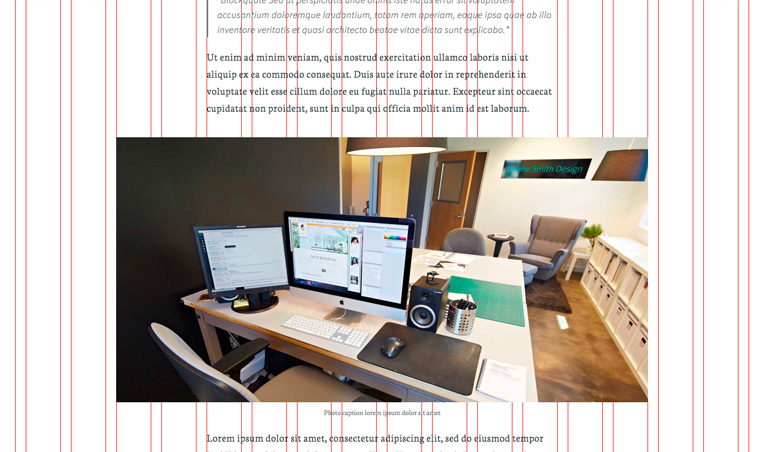
Most designers use a grid to organize content on the page. When I’m developing a website using their designs, it’s nice to be able to visually access that grid to ensure elements are all lining up as expected. This works great alongside my Column Class Generator, which provides the CSS for implementing the grid.
The following code allows you to add ?grid=true to any URL on the site and have the grid automatically appear on top of everything.
First, add this to your theme’s functions.php file:
| <?php | |
| /** | |
| * Grid Overlay | |
| * @link http://www.billerickson.net/overlay-css-grid | |
| */ | |
| function be_grid_overlay() { | |
| if( ! isset( $_GET['grid'] ) || 'true' !== $_GET['grid'] ) | |
| return; | |
| $columns = 16; | |
| echo '<div class="grid-overlay"><div class="wrap"><div class="gutter"></div>'; | |
| for( $i = 0; $i < $columns; $i++ ) { | |
| echo '<div class="col"></div><div class="gutter"></div>'; | |
| } | |
| echo '</div></div>'; | |
| } | |
| add_action( 'wp_footer', 'be_grid_overlay' ); |
It’s currently set to 16 columns, but you can change that by editing the $columns variable.
Then, add the following to your theme’s CSS file. Update the max-width, column size and gutter size to match your design. If you’d like to change the grid at different breakpoints, add some media queries as well.
| /* Grid | |
| ---------------------------------------------------------------------------------------------------- */ | |
| /* 1) Set grid max width */ | |
| .grid-overlay .wrap { | |
| max-width: 1380px; | |
| } | |
| /* 2) Set size of column and gutter */ | |
| .grid-overlay .gutter { | |
| width: 1.449275362%; /* 20/1380 */ | |
| } | |
| .grid-overlay .col { | |
| width: 4.710144928%; /* 65/1380 */ | |
| } | |
| /* Additional Styles */ | |
| .grid-overlay { | |
| position: fixed; | |
| top: 0; | |
| left: 0; | |
| width: 100%; | |
| height: 100%; | |
| z-index: 999; | |
| } | |
| .grid-overlay .wrap { | |
| margin: 0 auto; | |
| border-right: 1px solid #f00; | |
| padding: 0; | |
| } | |
| .grid-overlay .wrap > div { | |
| border-left: 1px solid #f00; | |
| height: 100vh; | |
| float: left; | |
| } |
The z-index on the grid is set to 999 so that it overlays all objects on the page. This also means you won’t be able to click anything on the page (you’ll be clicking on the grid). Change the z-index to -1 to put it behind everything. Example:

Marcy Diaz says
I was just thinking about where all the grid layout tools had gone this week because I really need one. Thank you so much for this one that’s quick to implement, and easy to configure to work the way I need it! I really appreciate (and use often!) your columns tool, as well.
Bill Erickson says
Thanks for the compliments! I’m glad the tools are helpful. I know I sure use them a lot 🙂
Alice G says
Oh wow, this is brilliant (and deceptively simple…)
Thank you so much Bill. 🙂
Amber Hinds says
This would make a great plugin, Bill, that could be turned on and off as needed. In fact, I think I’m going to go build one now. Thanks! 🙂
Bill Erickson says
Good idea! The biggest issue with making it a plugin is building in the functionality to customize the grid. Most sites have different sized grids, and often the grid is adjusted for tablet and mobile use. So the user will need to edit all the CSS anyway.
But I like the idea of being able to turn it on/off via a plugin. Maybe you could fork one of those CSS Editing plugins and make an options page that has a field for How Many Columns, and then a code editor with the base CSS already in place, which they can then tweak.
Amber Hinds says
The options page is a great idea. I’ll let you know what I come up with.
José says
I love the grid. Super useful. Just what I needed.
Thanks! !!
Jose
Richard says
Lovely!
Also, you can add
.grid-overlay { pointer-events: none; }to be able to click though the overlay