I have built many websites using WordPress’ new block-based editor, code-named Gutenberg.
I’ll walk you through the technical details you need as a WordPress developer building a Gutenberg website. I’ll then share how we approach these projects and provide some real-world examples.
Table of Contents
Building a Gutenberg theme
For the most part, a Gutenberg-optimized theme is just like any other WordPress theme. Your current WordPress theme will likely work great with Gutenberg.
Wide/Full Alignment
add_theme_support( 'align-wide' );
This adds “wide” and “full” options to the left, right, and center alignment options. This will be used primarily for images, but other blocks also support these alignment options.
You’ll need to add CSS to your theme for these alignment options to actually work, in the same way you have to style .alignleft for left-aligned images to work.
Editor Font Sizes
When editing paragraph text, a user can select different sizes in the settings panel on the right. This lets you define what sizes should be available.
// -- Disable custom font sizes
add_theme_support( 'disable-custom-font-sizes' );

// -- Editor Font Sizes
add_theme_support( 'editor-font-sizes', array(
	array(
		'name'      => __( 'Small', 'ea_genesis_child' ),
		'shortName' => __( 'S', 'ea_genesis_child' ),
		'size'      => 12,
		'slug'      => 'small'
	),
	array(
		'name'      => __( 'Normal', 'ea_genesis_child' ),
		'shortName' => __( 'M', 'ea_genesis_child' ),
		'size'      => 16,
		'slug'      => 'normal'
	),
	array(
		'name'      => __( 'Large', 'ea_genesis_child' ),
		'shortName' => __( 'L', 'ea_genesis_child' ),
		'size'      => 20,
		'slug'      => 'large'
	),
) );
You’ll also have to add CSS to your theme for this to work. Rather than hardcoding the font size on the paragraphs, Gutenberg adds a CSS class like .has-small-font-size. This helps keep the content separate from the styling and will simplify redesigns in the future.
Theme Colors
// -- Disable Custom Colors
add_theme_support( 'disable-custom-colors' );

// -- Editor Color Palette
add_theme_support( 'editor-color-palette', array(
	array(
		'name'  => __( 'Blue', 'ea_genesis_child' ),
		'slug'  => 'blue',
		'color'	=> '#59BACC',
	),
	array(
		'name'  => __( 'Green', 'ea_genesis_child' ),
		'slug'  => 'green',
		'color' => '#58AD69',
	),
) );
Gutenberg includes a color picker in certain blocks like paragraph and button. Rather than letting clients pick any color they want, we disable the color picker and define a few brand colors.
Like all the other theme options, these require additional CSS to function properly. When a block has the “Background Color” set to one of your theme colors, it adds a class of .has-{color}-background-color. Likewise, when the “Text Color” is set, it adds a class of .has-{color}-color.
Block Style Options
Each block type can have multiple style options. For instance, the Quote block comes with “Regular” and “Large” styles, while the Button block comes with “Round”, “Square”, and “Outline” styles.
You can add your own block styles using registerBlockStyle, and you can remove existing style options using unregisterBlockStyle.
Use SASS
I can’t imagine building a Gutenberg theme without SASS. You need to generate a frontend stylesheet and editor stylesheet, both with differing amounts of CSS.
For the Theme Colors feature described above, we use SASS loops to build the styles (see here).
Editor Styles
If your theme has defined editor styles, these are not automatically be loaded into Gutenberg, but you can turn it on with add_theme_support(). They will be prefixed with the correct CSS classes to target only the editor.
// Editor Styles
add_theme_support( 'editor-styles' );
add_editor_style( 'assets/css/editor-style.css' );
Alternatively, you can load a separate stylesheet using the enqueue_block_editor_assets hook, but you will need to prefix your CSS yourself so it only applies to the editor (not the WP backend menu, metaboxes…).
Do not load your entire frontend stylesheet in Gutenberg. You should only load styles relevant to the editor. In my editor-style partial, I only load my base, block-specific, and editor-specific styles.
Set block width in Gutenberg
Gutenberg already has some base styling applied to blocks, but their max-width doesn’t match the max-width we are using on the site. We use the following in a _gutenberg.scss partial to update the size of normal, wide, and full width blocks in the Gutenberg editor. $content-width is a SASS variable we have defined in _base.scss.
These styles should match your frontend styles. I’ve also added styles for customizing the post title.
/* Post title width */
.editor-post-title__block.wp-block {
	max-width: $content-width;

	/* Post title styling */
	.editor-post-title__input {
	}
}

/* Main column width */
.wp-block {
    max-width: $content-width;

	/* Wide column width */
	&[data-align="wide"] {
		max-width: none;

		@include media(">=medium") {
			max-width: none;
			margin-left: calc(25vw - 25%);
			margin-right: calc(25vw - 25%);
		}
	}

	/* Full column width */
	&[data-align="full"] {
		max-width: none;
	}
}
Creating block templates
You can simplify the writing experience by pre-populating the editor with a set of default blocks.
You can even customize what appears in each block by default. We used this on an attorney’s website so all case summaries had the same overall structure.
You can decide how strict you want to make the template. You can lock it completely (no new blocks, can’t remove/reorder existing blocks), lock insertions (no new blocks, but current blocks can be re-ordered), or have no locks and used the template as a starting guide.
Building Custom Blocks
The biggest question most theme developers will have is “Should I build my custom blocks from scratch in JavaScript, or use a plugin like Advanced Custom Fields?”
I think metaboxes make a great analogy. When I’m building a custom plugin that will be distributed and used by many, like Genesis Title Toggle, I build my metabox from scratch. This removes a plugin dependency (ACF) or a bundled library (CMB2) and keeps the plugin lean.
When I’m building a bunch of metaboxes for a specific client’s site, it’s better to leverage an existing tool like Advanced Custom Fields, Carbon Fields, or CMB2. I’m able to provide a higher quality result much faster than if I were to build everything from scratch.
I use the same approach to Gutenberg blocks. For client sites, I’m building my custom blocks with Advanced Custom Fields. When I release a public plugin that includes a block, it will be built from scratch.
More Tutorials
Here are some great Gutenberg-related tutorials from around the web:
- Extending Gutenberg Core Blocks with Custom Attributes and Controls
- Introduction Gutenberg’s Block Parser Class
Types of Gutenberg websites
There are really two types of Gutenberg websites: simple and custom.
Simple Gutenberg Websites
Gutenberg is a huge step forward for simple content sites. Clients can easily build beautiful and engaging pages of content with the core blocks. The theme development process for these sites is mostly CSS. We ensure the core blocks look great, match the client’s brand, and can address all their content requirements.
This is perfect for non-profits who need a low-cost, high-impact website. We used this approach for CARAS and College Discount Cards.
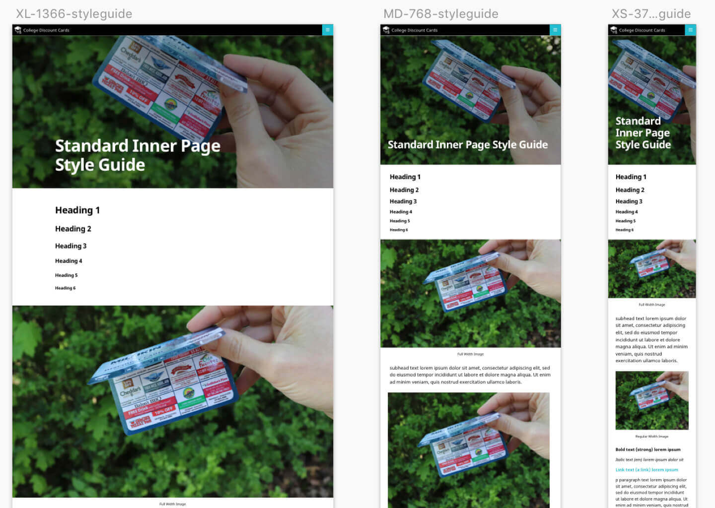
We start by designing a style guide featuring all the core blocks. Our designer then works with the client to mock up the key pages using these blocks. Once the designs are approved, I style the blocks and build the pages like legos.
Custom Gutenberg Websites
These sites follow our traditional web development process. Rather than letting the technology constrain our design and functionality, we first examine the client’s specific needs and document the desired features and user experience. We then design the user interface, mockup all the blocks (both core and custom), and mockup the page layouts necessary to build the site.
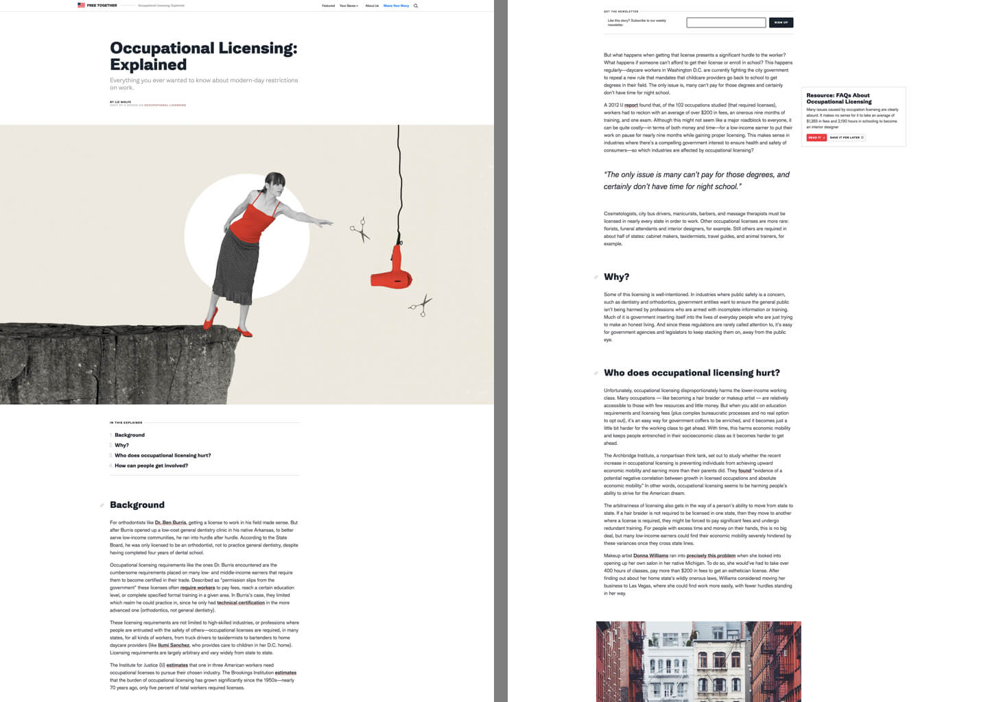
In addition to styling the core blocks, we build custom blocks to implement features not currently in core. The above example of Free Together includes a “Table of Contents” block that dynamically lists and links to each heading in the article.
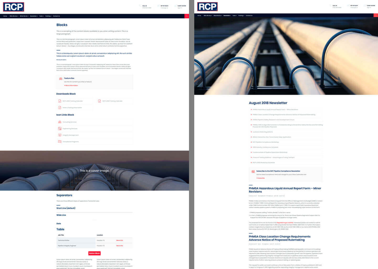
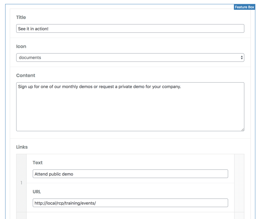
On RCP we built many custom blocks including a Feature Box, Icon Links, and Downloads.
Is Gutenberg the right choice?
You have to consider the value proposition for each project. We use the block editor on all websites. If we disable Gutenberg, it’s typically on a single template.
The benefits of Gutenberg include:
- Building a simple Gutenberg site will save us from building a more complex website that relies heavily on custom metaboxes. We can deliver a better product faster and cheaper.
- Many websites require complex content elements that are easy to implement as custom blocks but difficult to do with TinyMCE. For instance, the RCP project required 9 custom blocks. Before Gutenberg, these would be a mix of shortcodes with Shortcode UI, custom TinyMCE plugins, and metaboxes.
- We’d rather future-proof our projects by using the new editor rather than locking clients into outdated technology.
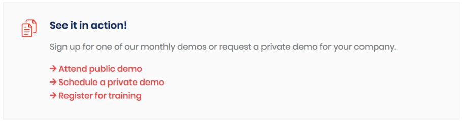
Here’s the “Feature Box” block we built on RCP. This is a great example of how Gutenberg can make content creation easier. Something like this would be difficult and complicated to insert in TinyMCE. See my article on Building Gutenberg blocks with ACF for more examples.
Gutenberg is not a page builder
Gutenberg is a block-based content editor, not a page builder. It’s hard to describe, but it will become more clear as you use it in the real world.
While the columns block does allow you to nest blocks inside of blocks, it’s fairly primitive and difficult to set up. The editing experience can be painful and you’ll need custom CSS to make it mobile responsive. It works for simple sites, but is not a replacement for true page builders like Beaver Builder or flexible content areas.
We use Gutenberg for most content pages on the site; it replaces a lot of custom page templates we would have developed previously. But for visually complex pages like the homepage and landing pages, sometimes we will disable Gutenberg for those templates and build a true page builder with Carbon Fields or Advanced Custom Fields.
It’s not that Gutenberg can’t be used for complex pages, it just might not be the easiest interface to use in those instances. As Gutenberg becomes more powerful, this will become less of an issue.
My website – including the homepage – is built completely with Gutenberg. It can be done.
Morten Rand-Hendriksen says
A suggestion / request / proposal:
Transitioning between themes is hard enough without custom colors getting lost in the mix. For this reason, I’ve proposed a standardized naming convention for `editor-color-palette`:
– Theme-specific colors which are likely to be refined across many themes should have slugs following the `theme-[color]` naming convention. So `theme-red`, `theme-blue` etc.
– All themes should have a `theme-primary` and `theme-secondary` color defined (can be any color)
– Any custom colors unlikely to be re-used should have slugs following the `custom-[color]` naming convention.
Example: https://github.com/wprig/wprig/blob/v2.0/inc/Editor/Component.php#L55-L114
This ensures a user who sets the background of a paragraph block to `theme-red` will still see a red background if they switch to a different theme.
Brandon Stewart says
Bill, I just want to thank you so much for your guide to Gutenberg. Your documentation is by far the most helpful for a basic php developer like me. Again thank you so much 🙂
Bill Erickson says
Thank you, I really appreciate hearing that!
Luke Netti says
How do you go about modifying gutenberg styles on the front end where gutenberg has already done styling? I want to style the separator block, but the styles already applied to it in the front-end.css file from gutenberg is quite specific, and not allowing me to style it the way I want. Is it bad practice to edit this front-end.css file or should I navigate around this a different way. If so, how do you go about styling core blocks?
Bill Erickson says
You could disable Gutenberg styles on the frontend, but that will likely cause more issues over time as Gutenberg adds new features and style options – things will work in the editor but be broken on the frontend because you don’t have styles for it.
I use one of two options:
1. If I want to make slight modifications to an existing style (ex: change the color of the separator line), I’ll use more specific CSS in my stylesheet.
2. If my style is very different from the existing styles (ex: using a company logo as the separator), I’ll register a new block style for my custom separator.
Luke Netti says
Thanks! I appreciate the answer. Your content here on the blog is great. Especially with developers trying to implement Gutenberg more, it’s useful to see examples and what others are doing.
Jon says
Thanks for the great guide, Bill! Do you recommend a lightweight Gutenberg-friendly theme to use as a starting point? Something with the best practices already implemented, but not heavy and relying on a lot of external scripts / stylesheets?
Bill Erickson says
You could try using my starter themes, EA Starter and EA Genesis Child.
Patrik Illy says
Thanks for great article.
I have some questions:
1. How do you work with breakpoints, I suppose, that you use more than two which defines Gutenberg?
2. How do you manage responsive and context specific spacings between components/blocks?
3. How do you manage responsive typography?
4. Last one is related more to WordPress globally. Do you have any solution how to remove loading=”lazy” for images above the fold?
I look forward to your answers, thanks…
Bill Erickson says
We use an atomic design approach, so our designers start by designing each block in at least two breakpoints (mobile and desktop). More complicated blocks might have a tablet design as well. Example: https://a.cl.ly/5zuNlOLp
We also have a global type system that every block uses, so if the heading in a block is “Display 2” I know it is 44px on mobile, 46px on tablet, and 53px on desktop. Example: https://a.cl.ly/Wnu0P6Zr
We don’t modify WordPress’ lazy loading tag on images.
Patrik Illy says
Very helpfull, thanks again.
Blocks from you pattern library don’t have vertical spacing (I think the same way). How do you manage spacing between blocks? And if you use space block, how do you manage responsiveness?
And your mobile and tablet breakpoints are same as Gutenberg?
Thanks
Bill Erickson says
We use a SASS variable to ensure consistent vertical spacing between blocks.
We don’t typically use the spacer block.
Our breakpoints are defined in the theme so might change on a per-theme basis, but typically mobile is <768 and tablet is 768-992px.